


ParagraphAI
Enabling Users to Write Faster Without Switching Apps
UX Design
UI Design

Project Overview
Design Challenge & Responsibilities
Problem
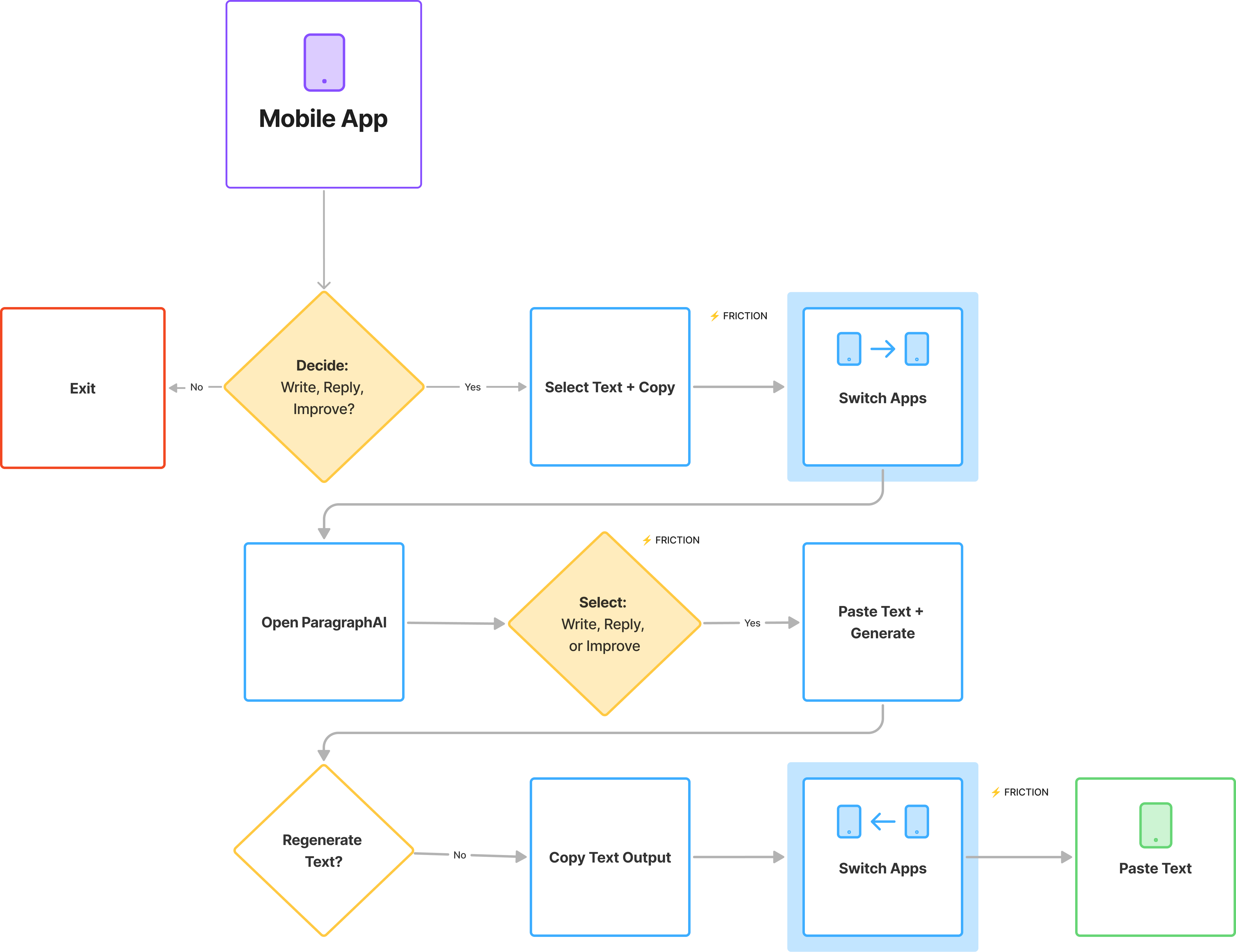
ParagraphAI offered an AI writing assistant software across desktop and mobile platforms. The mobile app was gaining traction, but users constantly had to copy-paste between the app and other platforms, which was a major source of friction.
Opportunity
If we could launch the first AI-powered iOS keyboard, it could differentiate ParagraphAI in a crowded market.

Timeline
Jan - Feb 2023
Role
Senior Product Designer
Team
- 1 Designer (myself)
- 1 Engineer
- 1 Co-founder
Scope
- UX/UI Design
- Cross-functional Collaboration
- Rapid Launch
Final Solution Impact

World’s 1st at Launch
World’s first GPT-3 powered iOS keyboard launched (March 2023).


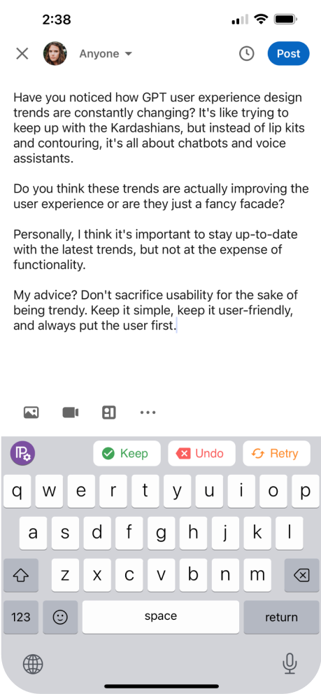
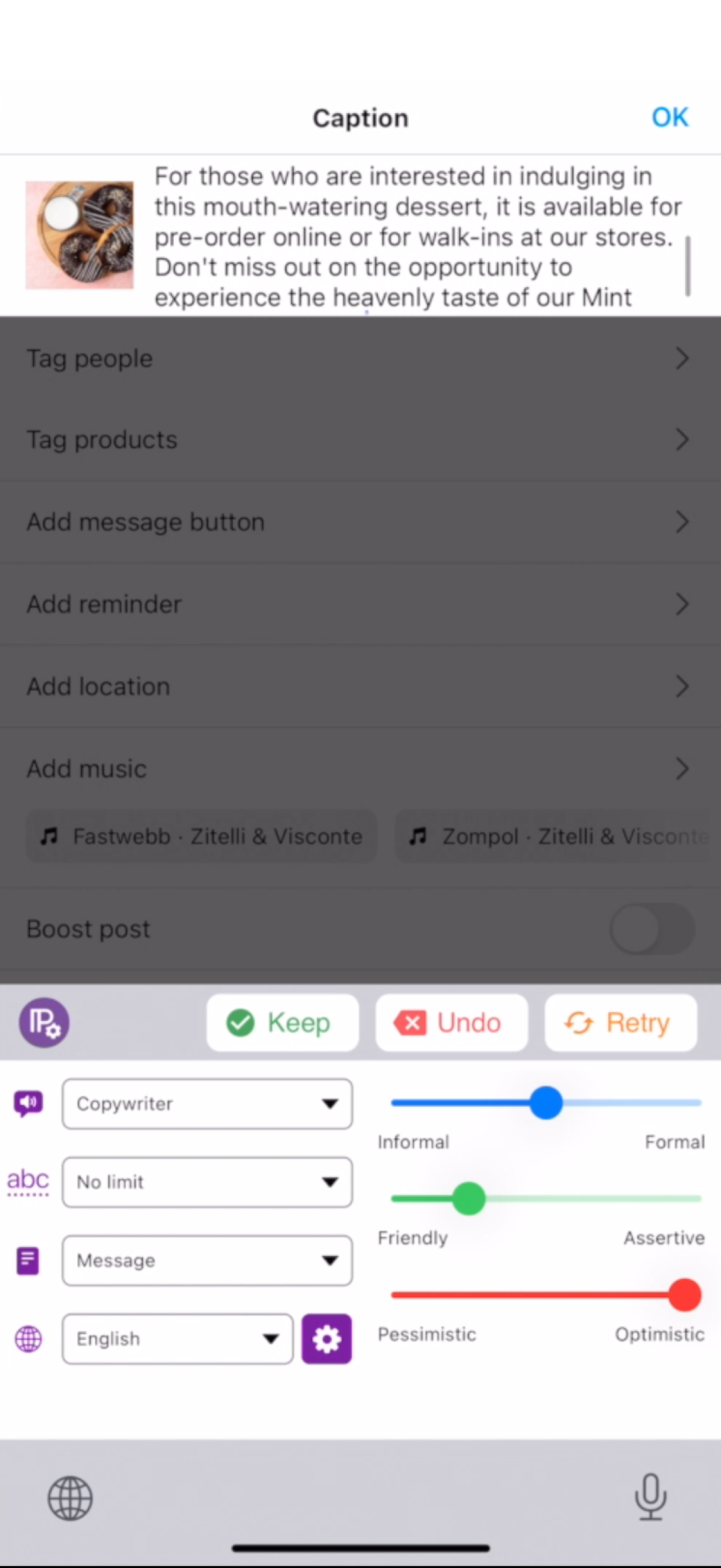
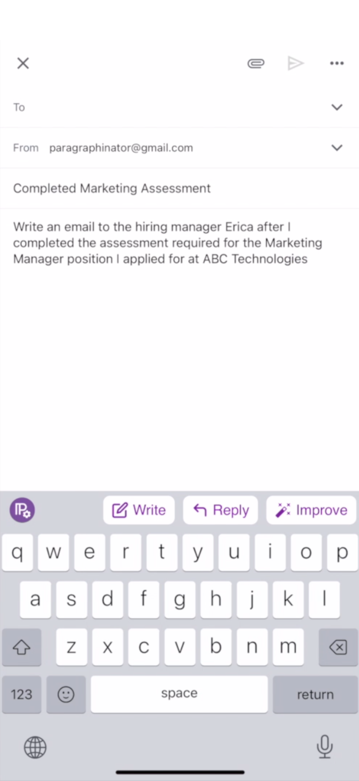
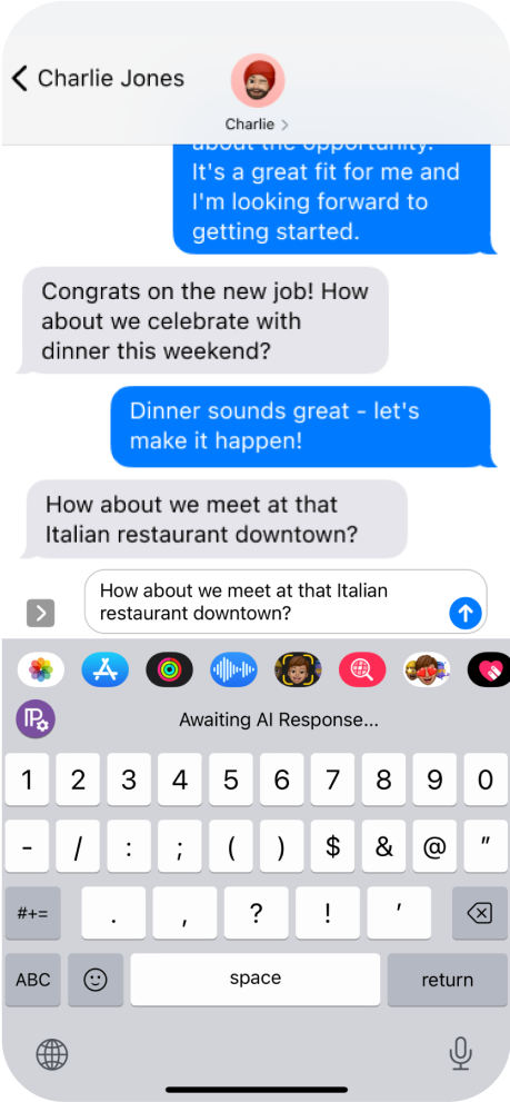
The ParagraphAI keyboard makes it incredibly simple to draft a full email or text message with just a few taps.

72% Session Length Increase
App Store adoption and engagement grew: 70% increase in user base, 72% increase in session length.
Switching between tabs is quick, and the keyboard remembers your last action.

Center of Marketing Campaigns
Keyboard became central to ParagraphAI’s marketing campaigns.
Because it’s in the keyboard, you can use it in any app—email, notes, social media.
Background
Problem Statement
When I joined, my role was to reduce effort for high-value customer segments. I saw the copy-paste gap as the friction undermining adoption. At the same time, the co-founder approached me to lead the design of an AI-powered iOS keyboard. In starting, I asked:
How might we help users compose and edit text directly in their favorite apps without disrupting their typing flow?
Scroll to View More 👉
Constraints & Tradeoffs
What looked like a simple keyboard layout problem quickly revealed itself as a set of systemic design challenges. Instead of treating these as roadblocks, I framed them into principles that could guide cross-team decision making:
Key Considerations
Space Was Scarce
With the co-founder unwilling to adjust the typing area, I reframed the constraint into a clarity-first principle: every pixel in the slim top bar had to justify its place. This gave me leverage to push for expandable states and minimal labels.
App Behaviors Varied
Because iOS privacy rules allowed context access in some apps (Mail) but blocked it in others (iMessage), I established a uniformity-first principle: user flows should feel consistent regardless of what data the AI could see.
Features Competed for Attention
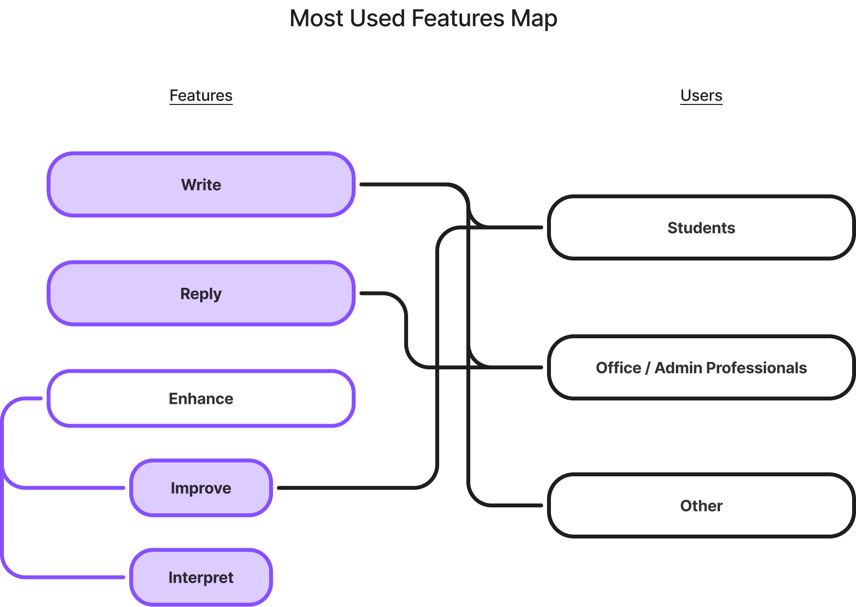
Write, Reply, and Enhance all demanded visibility. Enhance consisted of Improve and Interpret, and I prioritized Improve so our most-used features shipped clearly without overloading v1.

These principles became alignment tools across design, engineering, and leadership, helping me justify trade-offs and maintain coherence under pressure.
Design Process


01. Research
- Market Scan
- Personas


02. Ideate
- Sketches
- Flows & States


03. Design
- Wireframes


04. Deliver
- Figma Handover


05. Reflect
- Retrospective
- Next Steps
Desk Research
Consideration of Personas
Students (55%) made up the majority of users, relying heavily on Improve to refine essays and academic writing. Office/Admin professionals (40%) leaned on Reply to handle messages quickly. Across all groups, 93% started with Write.
User Distribution & Patterns
- Students (55%) → Heavy use of Improve for essays and academic writing.
- Office/Admin Professionals (40%) → Frequent Reply for quick responses.
- Across all users → 93% started with Write.
This revealed a tension: the same interface had to support rapid drafting/editing for students while offering lightweight messaging tools for professionals. These competing priorities informed which features were surfaced, sequenced, and emphasized in sketches.
Scroll to View More 👉
01
Research

Market Scan
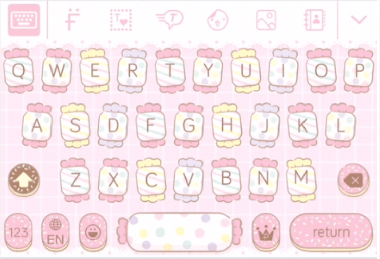
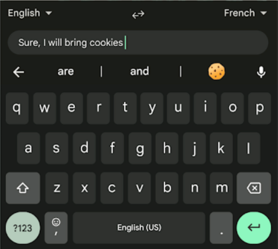
To anticipate user expectations, I reviewed 15 popular keyboard UIs, noting patterns that could inform interaction design for an AI-powered keyboard. I focused on the relationships between the features, layouts, and constraints for the target users.
Grammarly
In-line suggestion → keyboard as assistant
TypeWise
pattern recognition → alternative input possible
Pastel KeyboardTM VIP
non-standard layouts + animation → multi-screens
Gboard
predictive text + integrations → baseline user expectation
Key Insights
✅ Non-standard UI patterns were possible (such as expandable bars, animations, and multi-screen keyboards), but they had to be executed with clarity to avoid confusing users.
❌ Icons alone often failed to communicate intent, leaving users guessing.
These findings grounded both our prioritization and our design hypotheses. We didn’t need to reinvent keyboard interactions; instead, the challenge was to integrate AI features (like expandable input fields) without breaking typing flow or adding cognitive load.
How would we maintain feature visibility without breaking typing flow or overcomplicating the experience for our users?

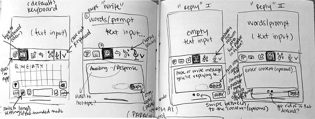
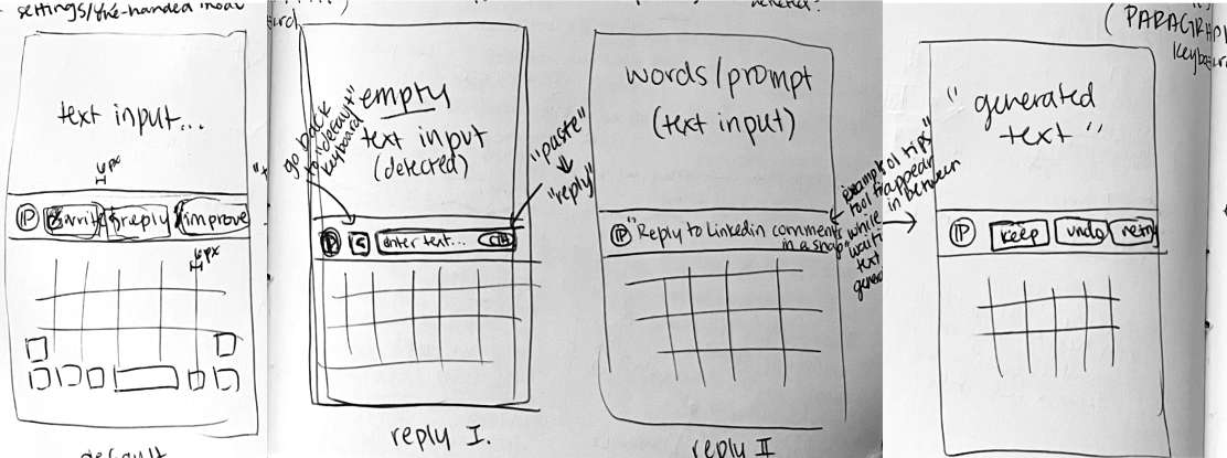
Low Fidelity
Sketches
I started with low-fidelity sketches to explore how Write, Reply, Improve, and Interpret could coexist in a single, intuitive interface. Early discussions had stalled on abstract trade-offs, so sketches became alignment tools. This approach made invisible constraints visible and driving conversation visually rather than theoretically.
Two Contrasting Layouts Emerged
Option A – Mini App Tabs
Extended beyond the top bar, dedicating a small panel to each feature. Clear separation and discoverability came at the cost of interaction overhead and reduced typing flow.
Scroll to View More 👉
Option B – Top Bar Only
Contained all actions inline above the keyboard. Preserved typing continuity but demanded careful prioritization to maintain clarity and future scalability.
Scroll to View More 👉
Micro-variations & Affordance Tests
I tested icon + label combinations within the top bar, for example:
- Pencil icon alone implied “Write,” but a label improved confidence.
- Wand icon for “Improve/Enhance” required a text label to clarify intent.
These explorations established a guiding principle: minimal redundancy is acceptable when it builds trust and confidence, prioritizing usability over extreme minimalism.
02
Ideate
These quick iterations became an essential means for communicating ideas across teams. They revealed different thinking processes and opened discussions around solving previously unseen problems.


03
Design
Alignment With Team and Stakeholder
Cross-Functional Design
I acted as a PM, operating as both design lead and facilitator, to translate competing priorities into actionable principles.
Systemic Tensions
Each design choice meant trading off between competing needs. For instance: how much information to show, where to show it, and how to make it predictable across apps.
Trade-offs Map
Tri-axis Diagram: Three core trade-offs that guided design choices around decisions related to real estate, discoverability, and consistency.
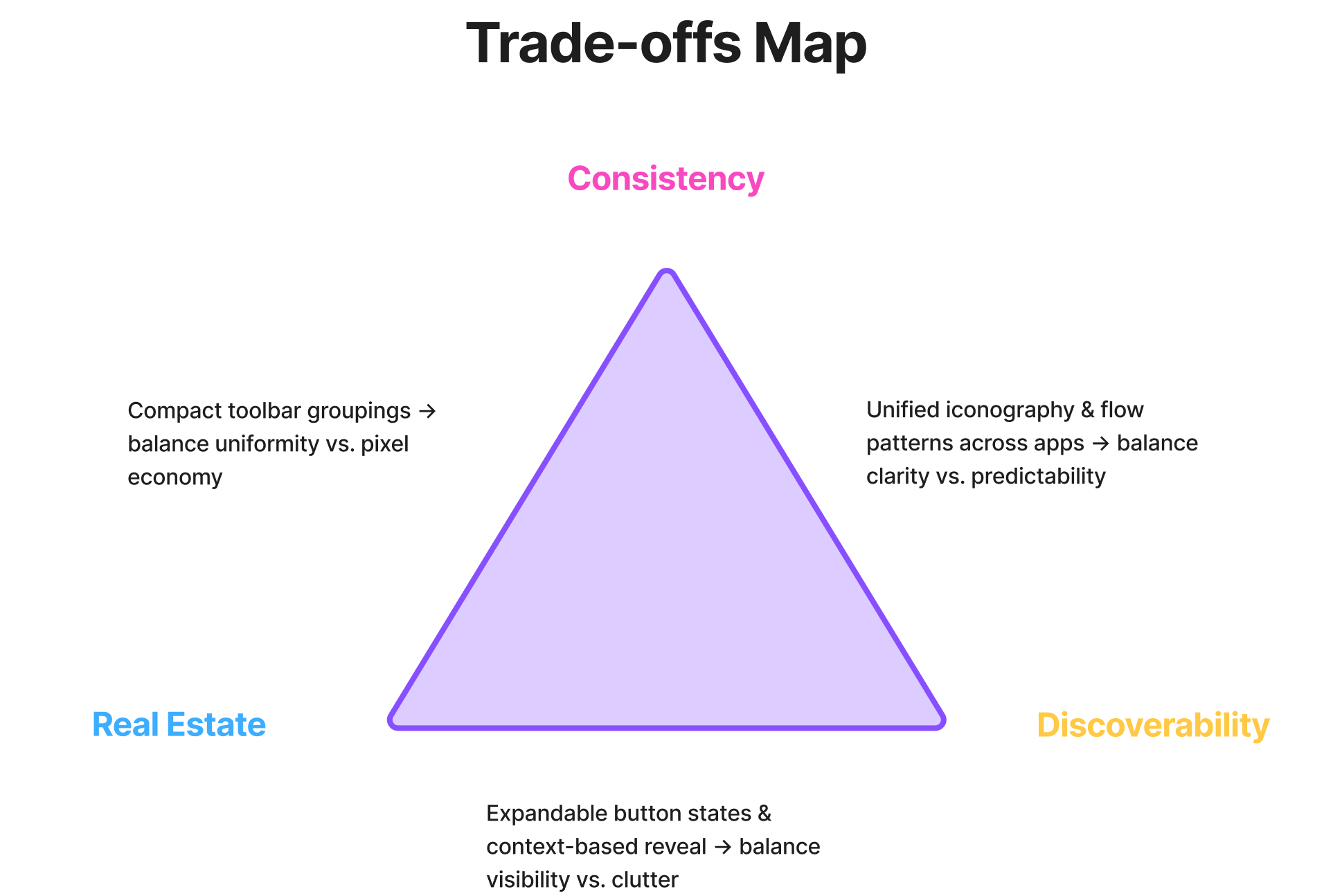
Scroll to View More 👉
Trade-off Resolutions
Alignment across teams enabled clarity, feasibility, and a coherent user experience.
Collaboration → Design Outcome
Venn Diagram: Each intersection shows how collaboration resolved tension between space, visibility, and predictability.
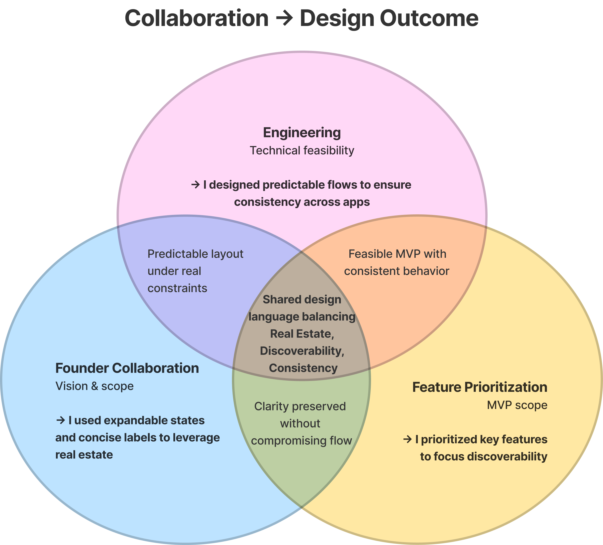
Scroll to View More 👉
Outcome
Each collaboration lens shaped how constraints became design leverage points:
- Where engineering met founder vision, I ensured predictability under constraint.
- Where founder goals met feature prioritization, I safeguarded clarity without compromise.
Together, these relationships created a shared design system that scaled without sacrificing usability.
Directing the Design Approach
With principles in place, I translated alignment into a structured design system. The keyboard needed to satisfy three non-negotiables:
Support Core Workflows
The users had to remain central to the features prioritization and strategy: Write for all users, Improve for students, Reply for professionals
Minimize Typing Disruption
The keyboard should feel like a natural extension, not a separate app, from the existing softwares on mobile and desktop.
Scale Responsibly
The MVP of the AI keyboard had to allow room for future features without overwhelming v1.
Testing sketches against these principles clarified trade-offs:
- Option A (Mini App Tabs) excelled at separating functions, but introduced interaction overhead and risked breaking flow. This posed a poor fit for students switching between editing and drafting in quick bursts.
- Option B (Top Bar Only) kept actions inline with typing, reinforcing flow, but demanded tighter trade-offs on discoverability and scalability.
Constraint-led validation surfaced a clear path: a lean top-bar design that surfaced key actions inline, avoided mode-switching, and kept the experience fluid across devices and app contexts.

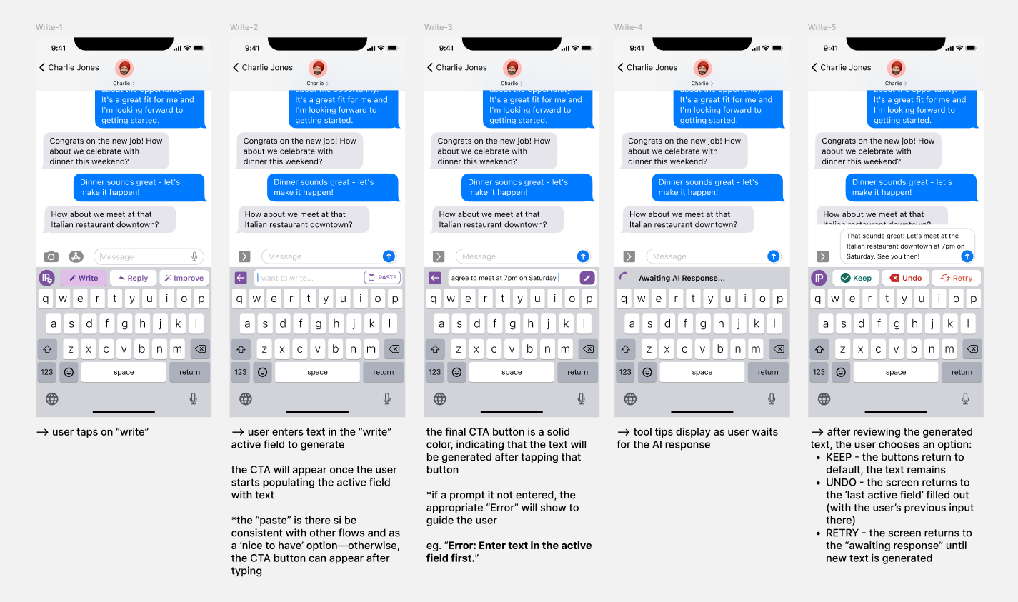
High Fidelity
Wireframes
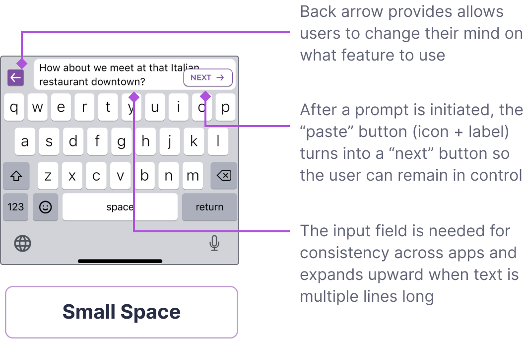
Wireframes translated principles into realistic interaction flows, testing the top-bar approach under actual constraints.
Standard Flow States
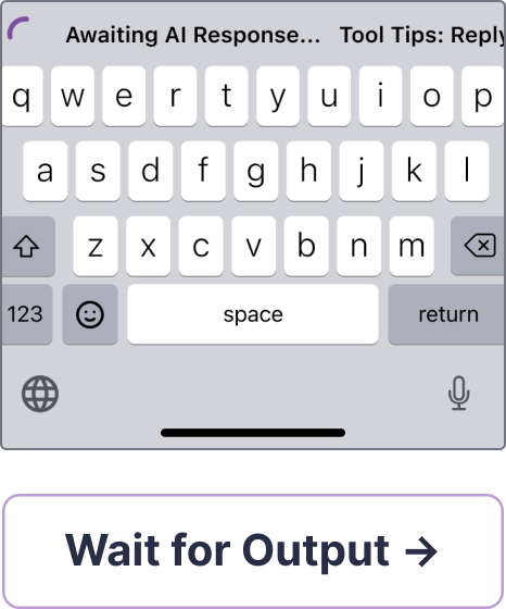
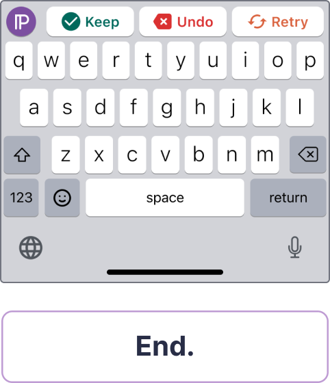
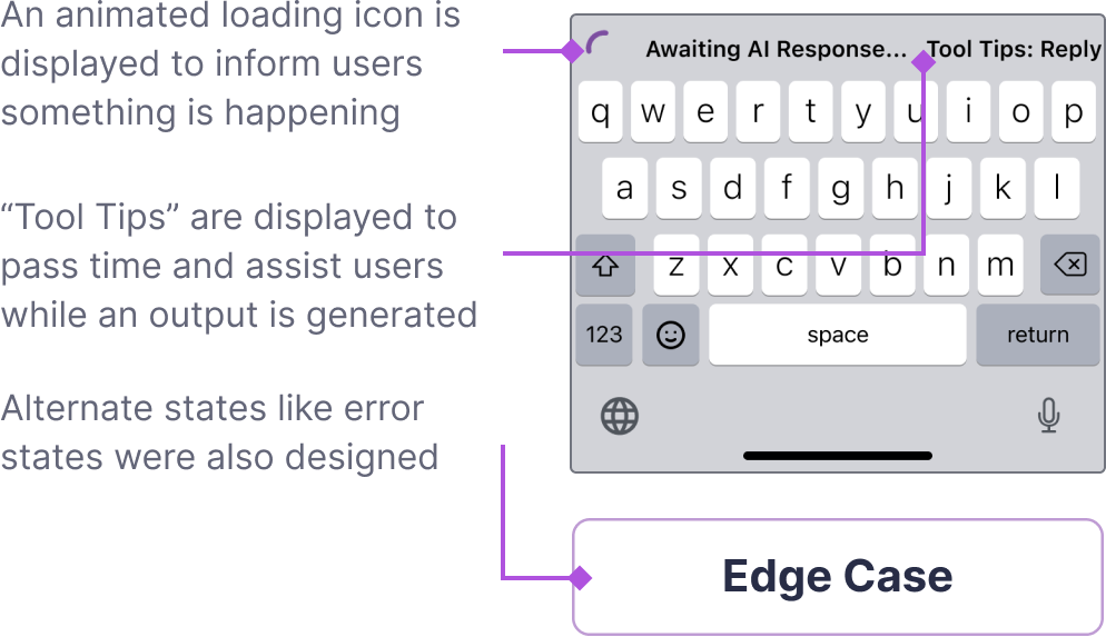
Scroll to View More 👉
Scroll to View More 👉
Key Design Choices
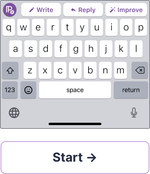
Top-bar Controls
Core features (Write, Reply, Improve) were surfaced in the bar above the keyboard, offering a compromise that met both real estate and usability needs.
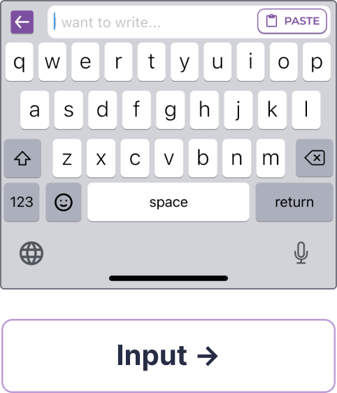
Expandable Prompt Field
Inspired by competitor patterns, I designed an expandable bar that gave users more space to review or edit prompts without disrupting typing flow.
Icon and Label Pairing
Wireframes confirmed that icons alone weren’t enough. Pairing them with short labels provided immediate clarity.

Cross-app Consistency
To minimize confusion from app-to-app technical differences, I deliberately scoped flows so that the interaction model felt uniform regardless of context.
We weren’t aiming for “perfection” at first launch. Instead, the goal was to develop the first-to-market AI iOS keyboard that users could interact with in a straightforward, uniform way.

04
Deliver
Solution
Final Design Outcome
Within weeks, we had a functional beta in users’ hands, and I transitioned ownership to the engineering team.
Annotated Screens & Mockups
Final Write Flow Annotated in Figma.Scroll to View More 👉

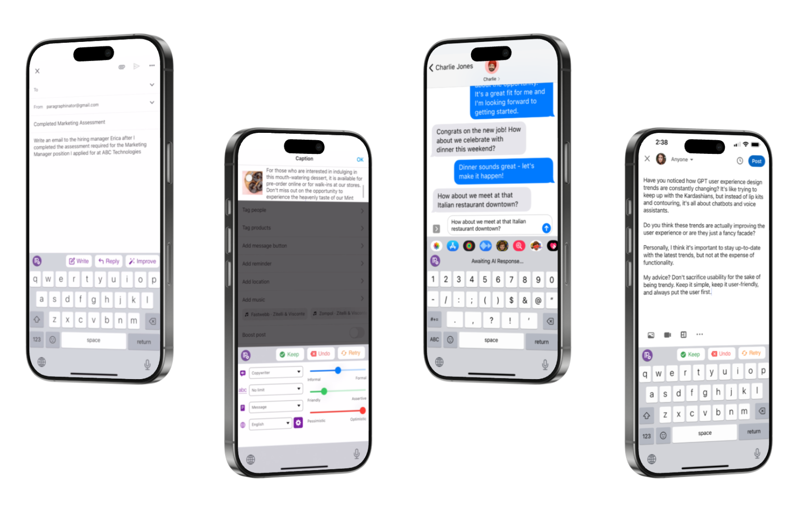
Mockups of Different Screen States Across Apps. Scroll to View More 👉

Stakeholder Responses
I couldn’t be more proud of our team here at ParagraphAI and what we have built (and continue to improve on). The keyboard has been our labor of love for a long time and it’s a great feeling to see it come out of stealth mode and be ready for consumer use.
What I truly appreciate is the standalone keyboard, which has all the basic writing, replying, and text improvement tools right at the top.
Press Coverage
Canada TV News

Mobile Syrup
Digital Trends
05
Reflect
Reflection
Retrospective
This project sharpened my ability to deliver clarity under constraints while aligning technical feasibility, business priorities, and user expectations. With no PM, I often acted as the connective tissue, working to frame principles, document trade-offs, and make sure decisions were both feasible and extensible.


3 Ways I Grew
- Technical fluency → Anticipating AI limitations and edge cases with engineering reduced downstream risk.
- Strategic alignment → Framing design choices as principles let me negotiate with leadership and keep usability intact under high pressure.
- Designing for scalability → By prioritizing adaptable flows, I set the stage for iteration post-launch, not just a one-off release.


Given More Time
I would have paired these principles with structured user testing earlier, particularly around discoverability. The speed-to-market mandate forced trade-offs, but long-term success depends on validating with data, not just intuition.


Big Takeaway
Ultimately, this project showed me how to lead under uncertainty. I had to not only adapt to constraints, but create alignment structures that ensured ParagraphAI shipped the world’s first GPT-3 powered keyboard and positioned it for growth.
The AI keyboard design successfully launched as the first one to market on iOS in March 2023, becoming pivotal to ParagraphAI and the company’s growth.


ParagraphAI
Enabling Users to Write Faster Without Switching Apps
UX Design
UI Design

Project Overview
Design Challenge & Responsibilities
Problem
ParagraphAI offered an AI writing assistant software across desktop and mobile platforms. The mobile app was gaining traction, but users constantly had to copy-paste between the app and other platforms, which was a major source of friction.
Opportunity
If we could launch the first AI-powered iOS keyboard, it could differentiate ParagraphAI in a crowded market.

Timeline
Jan - Feb 2023
Team
- 1 Designer (myself)
- 1 Engineer
- 1 Co-founder
Role
Senior Product Designer
Scope
- UX/UI Design
- Cross-functional Collaboration
- Rapid Launch
Final Solution Impact
World’s 1st at Launch
World’s first GPT-3 powered iOS keyboard launched (March 2023).
The ParagraphAI keyboard makes it incredibly simple to draft a full email or text message with just a few taps.
72% Session Length Increase
App Store adoption and engagement grew: 70% increase in user base, 72% increase in session length.
Switching between tabs is quick, and the keyboard remembers your last action.
Center of Marketing Campaigns
Keyboard became central to ParagraphAI’s marketing campaigns.
Because it’s in the keyboard, you can use it in any app—email, notes, social media.
Background
Problem Statement
When I joined, my role was to reduce effort for high-value customer segments. I saw the copy-paste gap as the friction undermining adoption. At the same time, the co-founder approached me to lead the design of an AI-powered iOS keyboard. In starting, I asked:
How might we help users compose and edit text directly in their favorite apps without disrupting their typing flow?
Constraints & Tradeoffs
What looked like a simple keyboard layout problem quickly revealed itself as a set of systemic design challenges. Instead of treating these as roadblocks, I framed them into principles that could guide cross-team decision making:
Key Considerations
Space Was Scarce
With the co-founder unwilling to adjust the typing area, I reframed the constraint into a clarity-first principle: every pixel in the slim top bar had to justify its place. This gave me leverage to push for expandable states and minimal labels.
App Behaviors Varied
Because iOS privacy rules allowed context access in some apps (Mail) but blocked it in others (iMessage), I established a uniformity-first principle: user flows should feel consistent regardless of what data the AI could see.
Features Competed for Attention
Write, Reply, and Enhance all demanded visibility. Enhance consisted of Improve and Interpret, and I prioritized Improve so our most-used features shipped clearly without overloading v1.
These principles became alignment tools across design, engineering, and leadership, helping me justify trade-offs and maintain coherence under pressure.
Design Process


01. Research
- Market Scan
- Personas


02. Ideate
- Sketches
- Flows & States


03. Design
- Wireframes


04. Deliver
- Figma Handover

05. Reflect
- Retrospective
- Next Steps
Desk Research
Consideration of Personas
Students (55%) made up the majority of users, relying heavily on Improve to refine essays and academic writing. Office/Admin professionals (40%) leaned on Reply to handle messages quickly. Across all groups, 93% started with Write.
User Distribution & Patterns
- Students (55%) → Heavy use of Improve for essays and academic writing.
- Office/Admin Professionals (40%) → Frequent Reply for quick responses.
- Across all users → 93% started with Write.
This revealed a tension: the same interface had to support rapid drafting/editing for students while offering lightweight messaging tools for professionals. These competing priorities informed which features were surfaced, sequenced, and emphasized in sketches.
01
Research

Market Scan
To anticipate user expectations, I reviewed 15 popular keyboard UIs, noting patterns that could inform interaction design for an AI-powered keyboard. I focused on the relationships between the features, layouts, and constraints for the target users.
Grammarly
In-line suggestion → keyboard as assistant
TypeWise
pattern recognition → alternative input possible
Pastel KeyboardTM VIP
non-standard layouts + animation → multi-screens
Gboard
predictive text + integrations → baseline user expectation
Key Insights
✅ Non-standard UI patterns were possible (such as expandable bars, animations, and multi-screen keyboards), but they had to be executed with clarity to avoid confusing users.
❌ Icons alone often failed to communicate intent, leaving users guessing.
These findings grounded both our prioritization and our design hypotheses. We didn’t need to reinvent keyboard interactions; instead, the challenge was to integrate AI features (like expandable input fields) without breaking typing flow or adding cognitive load.
How would we maintain feature visibility without breaking typing flow or overcomplicating the experience for our users?

Low Fidelity
Sketches
I started with low-fidelity sketches to explore how Write, Reply, Improve, and Interpret could coexist in a single, intuitive interface. Early discussions had stalled on abstract trade-offs, so sketches became alignment tools. This approach made invisible constraints visible and driving conversation visually rather than theoretically.
Two Contrasting Layouts Emerged
Option A – Mini App Tabs
Extended beyond the top bar, dedicating a small panel to each feature. Clear separation and discoverability came at the cost of interaction overhead and reduced typing flow.
Option B – Top Bar Only
Contained all actions inline above the keyboard. Preserved typing continuity but demanded careful prioritization to maintain clarity and future scalability.
Micro-variations & Affordance Tests
I tested icon + label combinations within the top bar, for example:
- Pencil icon alone implied “Write,” but a label improved confidence.
- Wand icon for “Improve/Enhance” required a text label to clarify intent.
These explorations established a guiding principle: minimal redundancy is acceptable when it builds trust and confidence, prioritizing usability over extreme minimalism.
02
Ideate
These quick iterations became an essential means for communicating ideas across teams. They revealed different thinking processes and opened discussions around solving previously unseen problems.


03
Design
Alignment With Team and Stakeholder
Cross-Functional Design
I acted as a PM, operating as both design lead and facilitator, to translate competing priorities into actionable principles.
Systemic Tensions
Each design choice meant trading off between competing needs. For instance: how much information to show, where to show it, and how to make it predictable across apps.
Trade-offs Map
Tri-axis Diagram: Three core trade-offs that guided design choices around decisions related to real estate, discoverability, and consistency.
Trade-off Resolutions
Alignment across teams enabled clarity, feasibility, and a coherent user experience.
Collaboration → Design Outcome
Venn Diagram: Each intersection shows how collaboration resolved tension between space, visibility, and predictability.
Outcome
Each collaboration lens shaped how constraints became design leverage points:
- Where engineering met founder vision, I ensured predictability under constraint.
- Where founder goals met feature prioritization, I safeguarded clarity without compromise.
Together, these relationships created a shared design system that scaled without sacrificing usability.
Directing the Design Approach
With principles in place, I translated alignment into a structured design system. The keyboard needed to satisfy three non-negotiables:
Support Core Workflows
The users had to remain central to the features prioritization and strategy: Write for all users, Improve for students, Reply for professionals
Minimize Typing Disruption
The keyboard should feel like a natural extension, not a separate app, from the existing softwares on mobile and desktop.
Scale Responsibly
The MVP of the AI keyboard had to allow room for future features without overwhelming v1.
Testing sketches against these principles clarified trade-offs:
- Option A (Mini App Tabs) excelled at separating functions, but introduced interaction overhead and risked breaking flow. This posed a poor fit for students switching between editing and drafting in quick bursts.
- Option B (Top Bar Only) kept actions inline with typing, reinforcing flow, but demanded tighter trade-offs on discoverability and scalability.
Constraint-led validation surfaced a clear path: a lean top-bar design that surfaced key actions inline, avoided mode-switching, and kept the experience fluid across devices and app contexts.

High Fidelity
Wireframes
Wireframes translated principles into realistic interaction flows, testing the top-bar approach under actual constraints.
Standard Flow States
Key Design Choices
Top-bar Controls
Core features (Write, Reply, Improve) were surfaced in the bar above the keyboard, offering a compromise that met both real estate and usability needs.
Expandable Prompt Field
Inspired by competitor patterns, I designed an expandable bar that gave users more space to review or edit prompts without disrupting typing flow.
Icon and Label Pairing
Wireframes confirmed that icons alone weren’t enough. Pairing them with short labels provided immediate clarity.
Cross-app Consistency
To minimize confusion from app-to-app technical differences, I deliberately scoped flows so that the interaction model felt uniform regardless of context.
We weren’t aiming for “perfection” at first launch. Instead, the goal was to develop the first-to-market AI iOS keyboard that users could interact with in a straightforward, uniform way.
04
Deliver
Solution
Final Design Outcome
Within weeks, we had a functional beta in users’ hands, and I transitioned ownership to the engineering team.
Annotated Screens & Mockups


Stakeholder Responses
I couldn’t be more proud of our team here at ParagraphAI and what we have built (and continue to improve on). The keyboard has been our labor of love for a long time and it’s a great feeling to see it come out of stealth mode and be ready for consumer use.
What I truly appreciate is the standalone keyboard, which has all the basic writing, replying, and text improvement tools right at the top.
Press Coverage
Canada TV News
Mobile Syrup
Digital Trends
05
Reflect
Reflection
Retrospective
This project sharpened my ability to deliver clarity under constraints while aligning technical feasibility, business priorities, and user expectations. With no PM, I often acted as the connective tissue, working to frame principles, document trade-offs, and make sure decisions were both feasible and extensible.


3 Ways I Grew
- Technical fluency → Anticipating AI limitations and edge cases with engineering reduced downstream risk.
- Strategic alignment → Framing design choices as principles let me negotiate with leadership and keep usability intact under high pressure.
- Designing for scalability → By prioritizing adaptable flows, I set the stage for iteration post-launch, not just a one-off release.


Given More Time
I would have paired these principles with structured user testing earlier, particularly around discoverability. The speed-to-market mandate forced trade-offs, but long-term success depends on validating with data, not just intuition.


Big Takeaway
Ultimately, this project showed me how to lead under uncertainty. I had to not only adapt to constraints, but create alignment structures that ensured ParagraphAI shipped the world’s first GPT-3 powered keyboard and positioned it for growth.
The AI keyboard design successfully launched as the first one to market on iOS in March 2023, becoming pivotal to ParagraphAI and the company’s growth.


ParagraphAI
Enabling Users to Write Faster Without Switching Apps
UX Design
UI Design

Project Overview
Design Challenge & Responsibilities
Problem
ParagraphAI offered an AI writing assistant software across desktop and mobile platforms. The mobile app was gaining traction, but users constantly had to copy-paste between the app and other platforms, which was a major source of friction.
Opportunity
If we could launch the first AI-powered iOS keyboard, it could differentiate ParagraphAI in a crowded market.

Timeline
Jan - Feb 2023
Team
- 1 Designer (myself)
- 1 Engineer
- 1 Co-founder
Role
Senior Product Designer
Scope
- UX/UI Design
- Cross-functional Collaboration
- Rapid Launch
Final Solution Impact
World’s 1st at Launch
World’s first GPT-3 powered iOS keyboard launched (March 2023).
The ParagraphAI keyboard makes it incredibly simple to draft a full email or text message with just a few taps.
72% Session Length Increase
App Store adoption and engagement grew: 70% increase in user base, 72% increase in session length.
Switching between tabs is quick, and the keyboard remembers your last action.
Center of Marketing Campaigns
Keyboard became central to ParagraphAI’s marketing campaigns.
Because it’s in the keyboard, you can use it in any app—email, notes, social media.
Background
Problem Statement
When I joined, my role was to reduce effort for high-value customer segments. I saw the copy-paste gap as the friction undermining adoption. At the same time, the co-founder approached me to lead the design of an AI-powered iOS keyboard. In starting, I asked:
How might we help users compose and edit text directly in their favorite apps without disrupting their typing flow?
Constraints & Tradeoffs
What looked like a simple keyboard layout problem quickly revealed itself as a set of systemic design challenges. Instead of treating these as roadblocks, I framed them into principles that could guide cross-team decision making:
Key Considerations
Space Was Scarce
With the co-founder unwilling to adjust the typing area, I reframed the constraint into a clarity-first principle: every pixel in the slim top bar had to justify its place. This gave me leverage to push for expandable states and minimal labels.
App Behaviors Varied
Because iOS privacy rules allowed context access in some apps (Mail) but blocked it in others (iMessage), I established a uniformity-first principle: user flows should feel consistent regardless of what data the AI could see.
Features Competed for Attention
Write, Reply, and Enhance all demanded visibility. Enhance consisted of Improve and Interpret, and I prioritized Improve so our most-used features shipped clearly without overloading v1.
These principles became alignment tools across design, engineering, and leadership, helping me justify trade-offs and maintain coherence under pressure.
Design Process


01. Research
- Market Scan
- Personas


02. Ideate
- Sketches
- Flows & States

03. Design
- Wireframes


04. Deliver
- Figma Handover


05. Reflect
- Retrospective
- Next Steps
Desk Research
Consideration of Personas
Students (55%) made up the majority of users, relying heavily on Improve to refine essays and academic writing. Office/Admin professionals (40%) leaned on Reply to handle messages quickly. Across all groups, 93% started with Write.
User Distribution & Patterns
- Students (55%) → Heavy use of Improve for essays and academic writing.
- Office/Admin Professionals (40%) → Frequent Reply for quick responses.
- Across all users → 93% started with Write.
This revealed a tension: the same interface had to support rapid drafting/editing for students while offering lightweight messaging tools for professionals. These competing priorities informed which features were surfaced, sequenced, and emphasized in sketches.
01
Research

Market Scan
To anticipate user expectations, I reviewed 15 popular keyboard UIs, noting patterns that could inform interaction design for an AI-powered keyboard. I focused on the relationships between the features, layouts, and constraints for the target users.
Grammarly
In-line suggestion → keyboard as assistant
TypeWise
pattern recognition → alternative input possible
Pastel KeyboardTM VIP
non-standard layouts + animation → multi-screens
Gboard
predictive text + integrations → baseline user expectation
Key Insights
✅ Non-standard UI patterns were possible, such as expandable bars, animations, and multi-screen keyboards, but they had to be executed with clarity to avoid confusing users.
❌ Icons alone often failed to communicate intent, leaving users guessing.
These findings grounded both our prioritization and our design hypotheses. We didn’t need to reinvent keyboard interactions; instead, the challenge was to integrate AI features (like expandable input fields) without breaking typing flow or adding cognitive load.
How would we maintain feature visibility without breaking typing flow or overcomplicating the experience for our users?

Low Fidelity
Sketches
I started with low-fidelity sketches to explore how Write, Reply, Improve, and Interpret could coexist in a single, intuitive interface. Early discussions had stalled on abstract trade-offs, so sketches became alignment tools. This approach made invisible constraints visible and driving conversation visually rather than theoretically.
Two Contrasting Layouts Emerged
Option A – Mini App Tabs
Extended beyond the top bar, dedicating a small panel to each feature. Clear separation and discoverability came at the cost of interaction overhead and reduced typing flow.
Option B – Top Bar Only
Contained all actions inline above the keyboard. Preserved typing continuity but demanded careful prioritization to maintain clarity and future scalability.
Micro-variations & Affordance Tests
I tested icon + label combinations within the top bar, for example:
- Pencil icon alone implied “Write,” but a label improved confidence.
- Wand icon for “Improve/Enhance” required a text label to clarify intent.
These explorations established a guiding principle: minimal redundancy is acceptable when it builds trust and confidence, prioritizing usability over extreme minimalism.
02
Ideate
These quick iterations became an essential means for communicating ideas across teams. They revealed different thinking processes and opened discussions around solving previously unseen problems.


03
Design
Alignment With Team and Stakeholder
Cross-Functional Design
I acted as a PM, operating as both design lead and facilitator, to translate competing priorities into actionable principles.
Systemic Tensions
Each design choice meant trading off between competing needs. For instance: how much information to show, where to show it, and how to make it predictable across apps.
Trade-offs Map
Tri-axis Diagram: Three core trade-offs that guided design choices around decisions related to real estate, discoverability, and consistency.
Trade-off Resolutions
Alignment across teams enabled clarity, feasibility, and a coherent user experience.
Collaboration → Design Outcome
Venn Diagram: Each intersection shows how collaboration resolved tension between space, visibility, and predictability.
Outcome
Each collaboration lens shaped how constraints became design leverage points:
- Where engineering met founder vision, I ensured predictability under constraint.
- Where founder goals met feature prioritization, I safeguarded clarity without compromise.
Together, these relationships created a shared design system that scaled without sacrificing usability.
Directing the Design Approach
With principles in place, I translated alignment into a structured design system. The keyboard needed to satisfy three non-negotiables:
Support Core Workflows
The users had to remain central to the features prioritization and strategy: Write for all users, Improve for students, Reply for professionals
Minimize Typing Disruption
The keyboard should feel like a natural extension, not a separate app, from the existing softwares on mobile and desktop.
Scale Responsibly
The MVP of the AI keyboard had to allow room for future features without overwhelming v1.
Testing sketches against these principles clarified trade-offs:
- Option A (Mini App Tabs) excelled at separating functions, but introduced interaction overhead and risked breaking flow. This posed a poor fit for students switching between editing and drafting in quick bursts.
- Option B (Top Bar Only) kept actions inline with typing, reinforcing flow, but demanded tighter trade-offs on discoverability and scalability.
Constraint-led validation surfaced a clear path: a lean top-bar design that surfaced key actions inline, avoided mode-switching, and kept the experience fluid across devices and app contexts.

High Fidelity
Wireframes
Wireframes translated principles into realistic interaction flows, testing the top-bar approach under actual constraints.
Standard Flow States
Key Design Choices
Top-bar Controls
Core features (Write, Reply, Improve) were surfaced in the bar above the keyboard, offering a compromise that met both real estate and usability needs.
Expandable Prompt Field
Inspired by competitor patterns, I designed an expandable bar that gave users more space to review or edit prompts without disrupting typing flow.
Icon and Label Pairing
Wireframes confirmed that icons alone weren’t enough. Pairing them with short labels provided immediate clarity.
Cross-app Consistency
To minimize confusion from app-to-app technical differences, I deliberately scoped flows so that the interaction model felt uniform regardless of context.
We weren’t aiming for “perfection” at first launch. Instead, the goal was to develop the first-to-market AI iOS keyboard that users could interact with in a straightforward, uniform way.

04
Deliver
Solution
Final Design Outcome
Within weeks, we had a functional beta in users’ hands, and I transitioned ownership to the engineering team.
Annotated Screens & Mockups

Stakeholder Responses
I couldn’t be more proud of our team here at ParagraphAI and what we have built (and continue to improve on). The keyboard has been our labor of love for a long time and it’s a great feeling to see it come out of stealth mode and be ready for consumer use.
What I truly appreciate is the standalone keyboard, which has all the basic writing, replying, and text improvement tools right at the top.
Press Coverage
Canada TV News
Mobile Syrup
Digital Trends
05
Reflect
Reflection
Retrospective
This project sharpened my ability to deliver clarity under constraints while aligning technical feasibility, business priorities, and user expectations. With no PM, I often acted as the connective tissue, working to frame principles, document trade-offs, and make sure decisions were both feasible and extensible.


3 Ways I Grew
- Technical fluency → Anticipating AI limitations and edge cases with engineering reduced downstream risk.
- Strategic alignment → Framing design choices as principles let me negotiate with leadership and keep usability intact under high pressure.
- Designing for scalability → By prioritizing adaptable flows, I set the stage for iteration post-launch, not just a one-off release.


Given More Time
I would have paired these principles with structured user testing earlier, particularly around discoverability. The speed-to-market mandate forced trade-offs, but long-term success depends on validating with data, not just intuition.


Big Takeaway
Ultimately, this project showed me how to lead under uncertainty. I had to not only adapt to constraints, but create alignment structures that ensured ParagraphAI shipped the world’s first GPT-3 powered keyboard and positioned it for growth.
The AI keyboard design successfully launched as the first one to market on iOS in March 2023, becoming pivotal to ParagraphAI and the company’s growth.