


Acorn
Designing Better Products with UX/UI Design
UX Research
UX Design
Project Overview
Design Challenge & Responsibilities
Challenge
Design a mobile or wearable app that supports remote employees during onboarding to help them feel more connected to their team and company.
Opportunity
Remote onboarding often lacks clarity, structure, and personal connection, which causes stress and disengagement. This project explored how UX design can humanize the onboarding experience, even from a distance.

Timeline
Oct 23 – Dec 18, 2022 (8 weeks)
Team
4 designers (remote collaboration)
Responsibilities
- UX Research & Synthesis
- Interaction Design & Prototyping
- Usability Testing
- Project Management
Tools


Problem Statement
At this early stage, I considered how onboarding isn’t just a checklist, but a moment of transformation for people. Too often, tools focus on efficiency but forget about integration—not of systems, but of humans into teams. That became the gap Acorn would aim to fill.
How might we support the onboarding process for remote workers so they feel more connected to their new company?
Final Solution Impact

Scalable Remote Onboarding
Acorn’s all-in-one hub extended beyond onboarding, driving long-term engagement and supporting growing teams.


I could see using Acorn well beyond onboarding. It really helps keep things connected and organized as teams grow.

Confidence Through Progress
Acorn reduced overwhelm with clear, motivating progress tracking. 83% of users said it helped them stay on track and engaged.
I really like the Acorn thing—how when you check things off, you get a little reward. It would push me to do it.

Designed to Flex and Grow
Major design pivots made Acorn more intuitive, scalable, and ready to support complex organizations.
The way the team structure was designed made it really easy to follow. It's clear they thought about how this would scale as companies grow.
Design Process


01. Discover
- Competitor Audit
- User Interviews
- Affinity Mapping
- User Personas
- Journey Mapping


02. Define
- Vision Setting
- Feature Prioritizing
- Scenarios
- Task Flows
- Wireflows

03. Design
- Mid-Fidelity Wireframes
- High-Fidelity UI
- Branding & Design System


04. Test
- Usability Testing
- Thematic Analysis
- Iterations Synopsis


05. Deliver
- Interactive Prototype
- Retrospective
- Business Opportunities
- Next Steps
Desk Research
Competitor Audit
We began by asking: Are we entering a red ocean, or can we carve out a blue one?
I led a competitor audit of 8 onboarding platforms, evaluating not just their features, but the emotional experience they offered new hires.
✅ High demand for streamlined all-in-one tools
❌ Limited support for human connection in remote onboarding
Key Findings
Our initial insights opened space for us to focus on emotional and social aspects — not just HR logistics.


01
Discover

We didn’t need to reinvent HR software. We needed to make remote onboarding more human.
User Research
User Interviews
We interviewed 10 remote professionals across tech, marketing, and nonprofit sectors. I co-designed the interview guide and led multiple sessions, balancing emotional insights with operational details with questions like:
When joining a new company/entering a new job, what is most important to you?
Could you summarize your onboarding process? What went well? What didn’t go well?
What were the general/HR activities you had to do and what were the role-specific activities you had to do?
What do you wish had been incorporated into your remote onboarding that wasn’t?
How did onboarding remotely compare to past jobs where you onboarded in person?
Research Synthesis
Affinity Map
After the interviews, we built an affinity map to cluster recurring themes. What emerged were three consistent emotional pain points that hadn’t been fully addressed by existing tools.
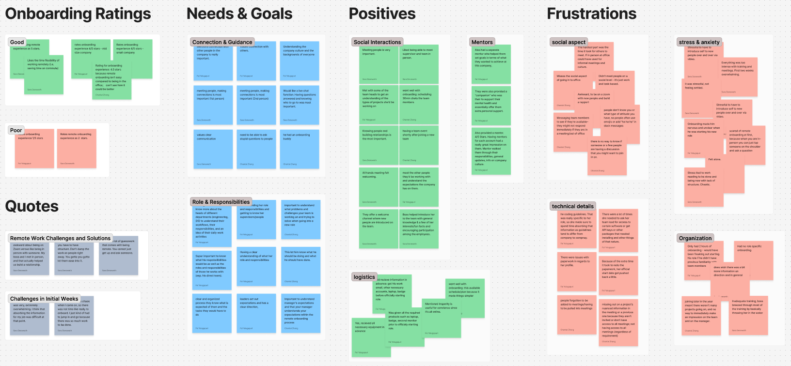
Affinity map analyzing quantitative and qualitative user interview data to show patterns and trends sorted into categories like: “connection and guidance,” “social interactions,” “onboarding organization,” and “technical details.” (Scroll to View More 👉)
Key Insights
Lack of Connection
Remote workers struggled to understand their team’s structure or feel part of the group, especially when informal introductions were skipped.
I wasn’t sure how I fit into the team compared with my coworkers.
Overwhelm & Ambiguity
Disorganized onboarding processes left new hires feeling lost. A lack of clear milestones or guidance made it worse.
The first two weeks were extremely overwhelming. I didn’t know what the priorities were.
Tech Access Friction
Remote environments amplified tech-related friction, such as figuring out permissions and accessing basic tools.
There’s a lot of guesswork. You can’t just get up and ask someone.
User Personas
Reflecting on our desk and user research, I guided the team in distilling raw data into a human-centered design strategy. We focused on two key tools to bridge the gap between insight and action: personas and user journeys. These tools helped us clearly articulate the needs of both new hires and their onboarding managers, highlighting pain points and uncovering opportunities for innovation.
Scroll to View More 👉
Scroll to View More 👉
User Journeys
Scroll to View More 👉
Scroll to View More 👉
Surprisingly, the biggest issue for users wasn't the amount of onboarding content; it was how difficult that onboarding content was to access, navigate, and make use of.
Ideation
Product Vision
The goal of our mobile app was to transform the remote onboarding experience from something isolating and confusing into something clear, motivating, and socially connected. After synthesizing our research and aligning with team discussions, we crafted a vision to guide design decisions:
Acorn is a mobile onboarding companion that helps remote new hires feel connected, confident, and ready to contribute from day one. Through personalized checklists, intuitive progress tracking, and helpful resources, Acorn empowers new hires while building a sense of momentum and belonging.
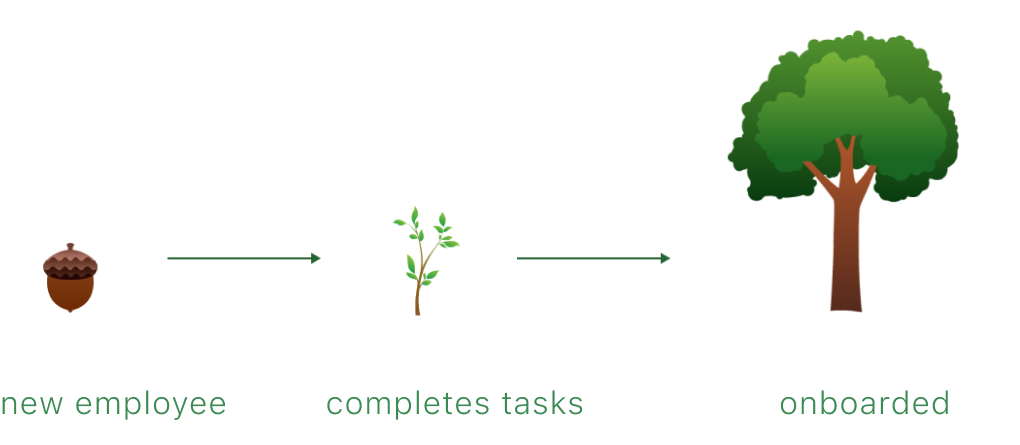
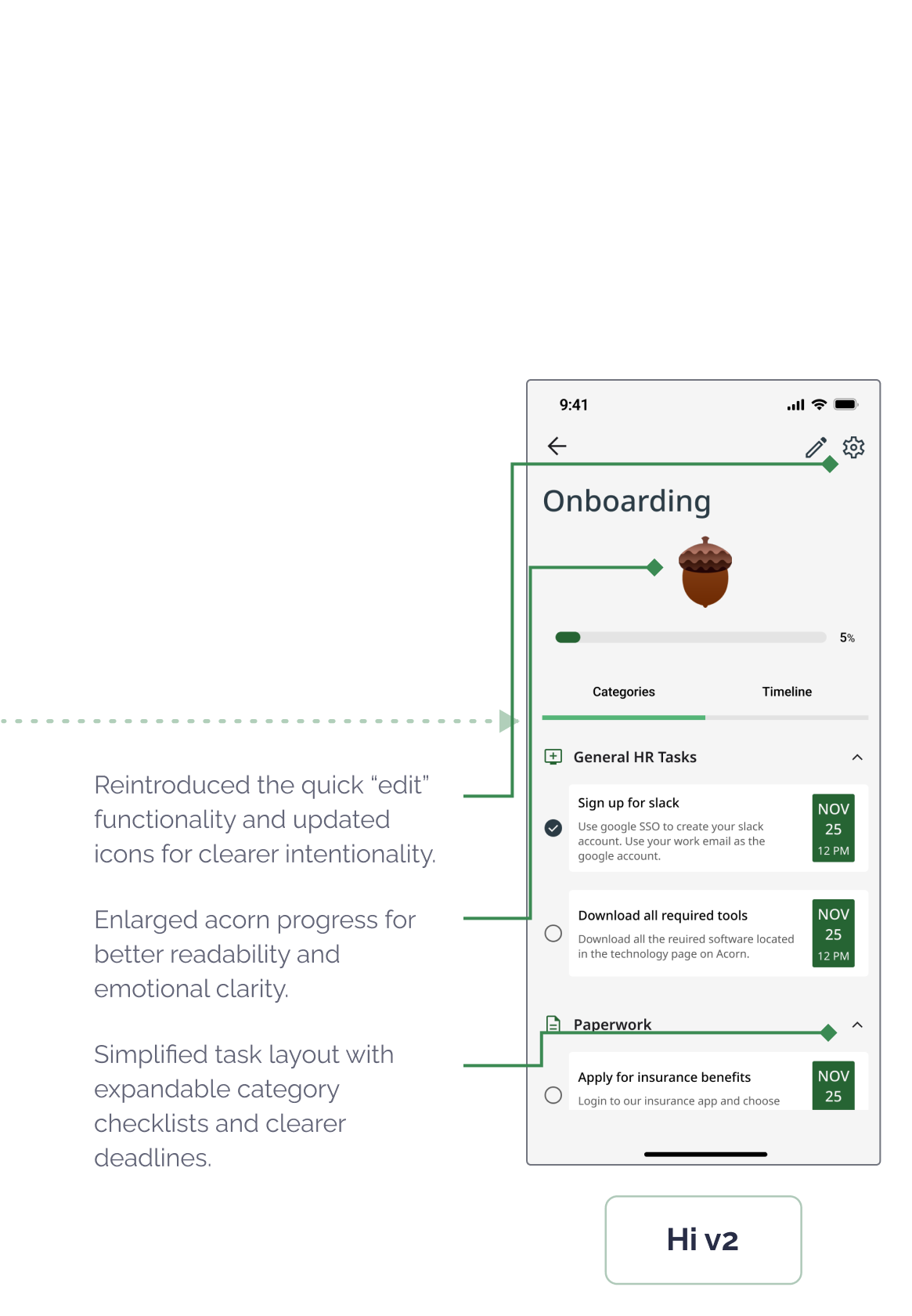
We introduced a gentle growth metaphor: an acorn that grows into a tree as tasks are completed. The aim was for it to provide emotional reinforcement for progress and to visualize growth in a warm, encouraging way.
App Design Goals
To translate our vision into an actionable strategy, I defined five core app design goals. These would directly support both of our key personas (new hires and team managers), while addressing the emotional and logistical gaps uncovered in research:
Sticky Experience
Build an intuitive, mobile-first app (Android/iOS) that makes onboarding feel lightweight, clear, and rewarding from day one.
Behavioral Nudges
Use subtle, customizable reminders and check-ins to help users feel engaged, supported, and connected to their team without overwhelming them.
Task Tracking
Include transparent onboarding roadmaps and goal-setting features to help new hires track their own progress and increase autonomy and confidence.
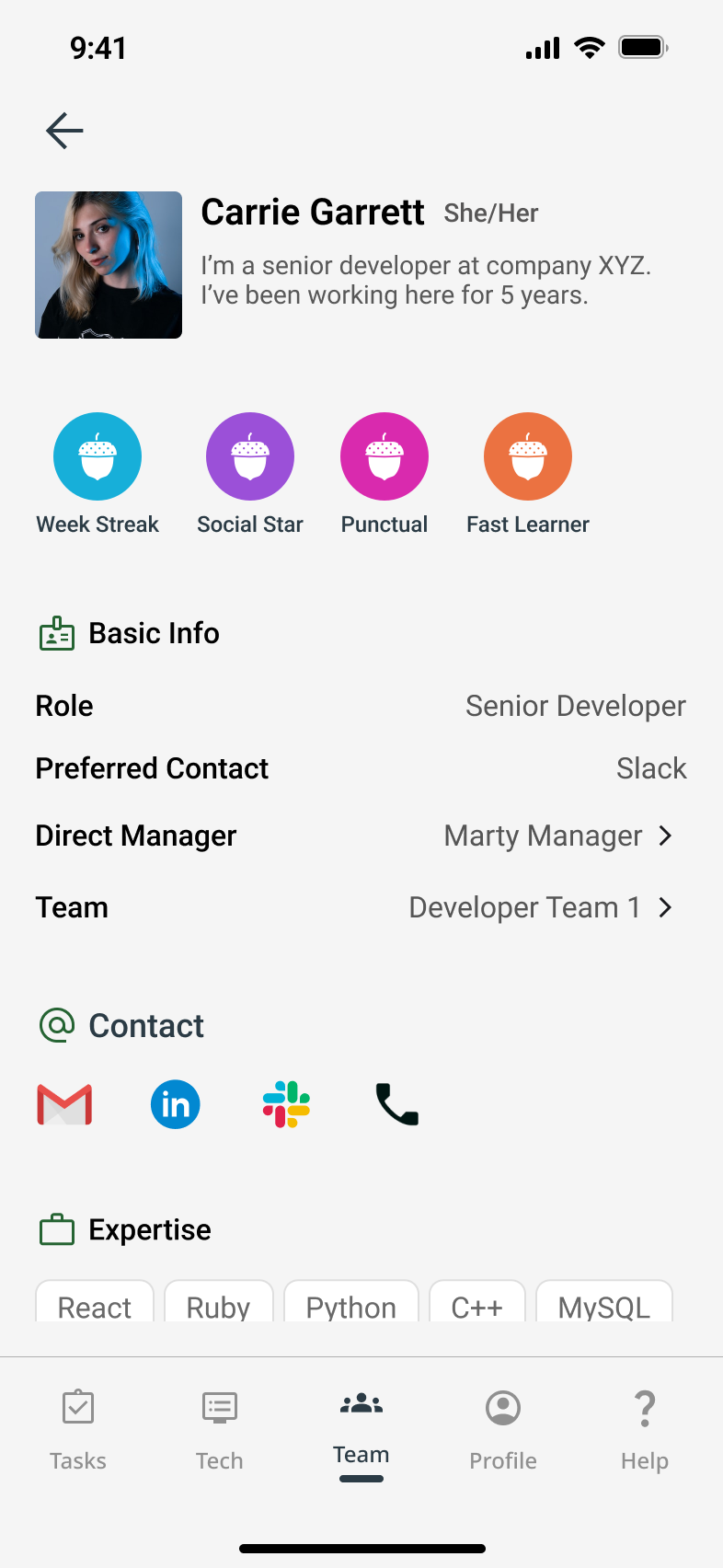
Personalization
Allow users to create meaningful profiles with both personal and professional context, supporting authentic team introductions and connections.
Social Motivation
Incorporate activity sharing and optional social integrations to recreate the informal moments that build team trust and cohesion in remote settings.
Features List
I worked with my team to translate these goals into six core features — intentionally scoped to balance user impact, simplicity, and feasibility within our project timeline. Each feature mapped directly to a recurring need we heard during interviews, ensuring our solution remained focused, necessary, and user-driven.
Feature
Application
Solves for
- Interaction Monitoring
Tracks onboarding completion and visually grows the user’s acorn into a tree
😵 Overwhelm & Ambiguity
- Target Setting
Provides a dynamic onboarding checklist with a progress bar
😵 Overwhelm & Ambiguity
- Settings & Configurations
Provides a dynamic onboarding checklist with a progress bar
😵 Overwhelm & Ambiguity
- Social Media Integration
Lets users share profile updates and milestones
💬 Lack of Connection
- Unique User Profiles
Displays team roles and bios to support relationship-building remotely
💬 Lack of Connection
- Resources & Support
Offers tech and general onboarding help in a centralized location
🧩 Tech Access Friction
Scroll to View More 👉
02
Define
Architecture
User Scenarios & Task Analyses
With a clear product vision, feature set, and defined user types, our team created three distinct user scenarios rooted in prioritized user stories. These helped us visualize how each user type might experience the Acorn app — highlighting their goals, tasks, frustrations, and emotional journey throughout onboarding.
For each scenario, we broke down users' top goals into detailed task diagrams. This helped us understand action complexity, mental load, and potential friction points early in the design phase.
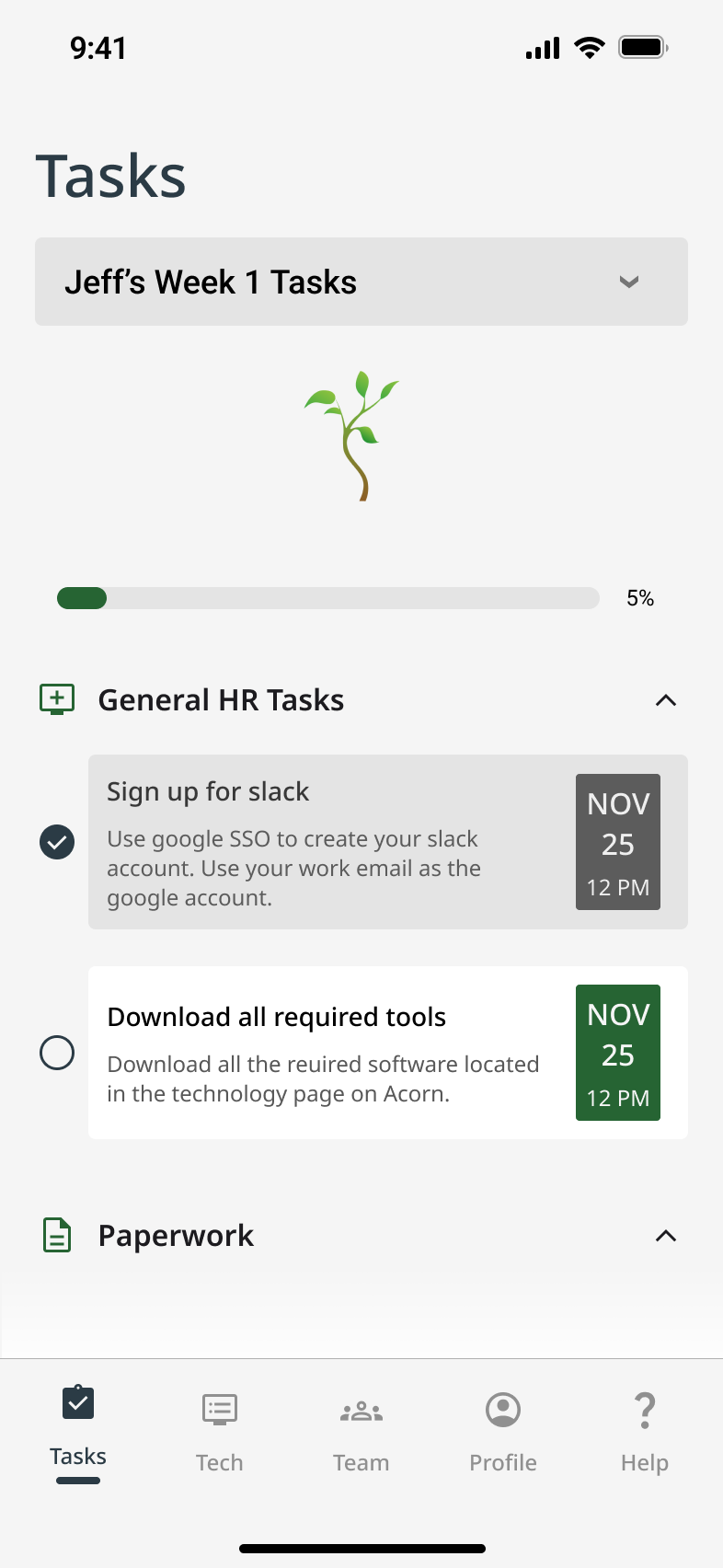
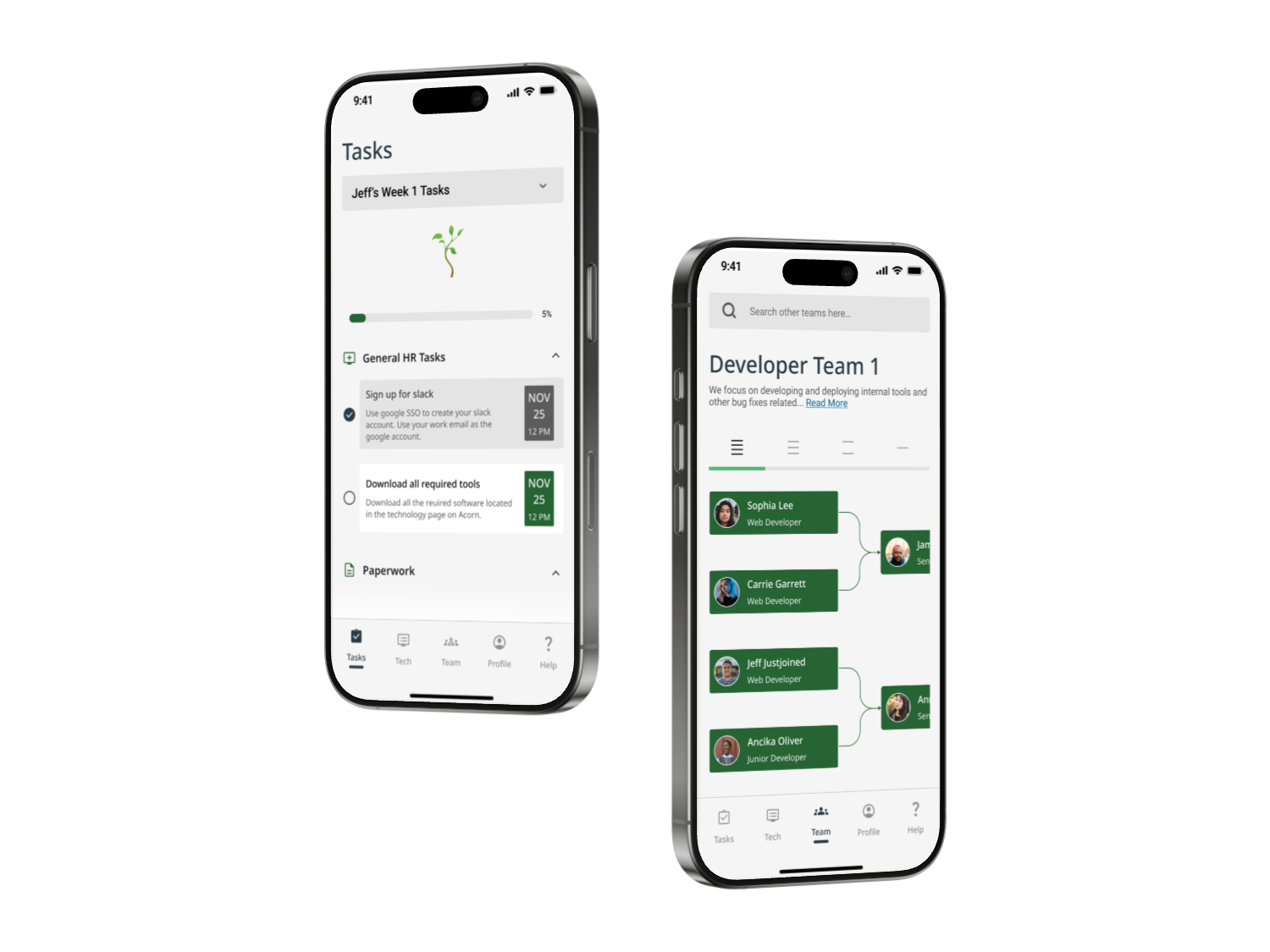
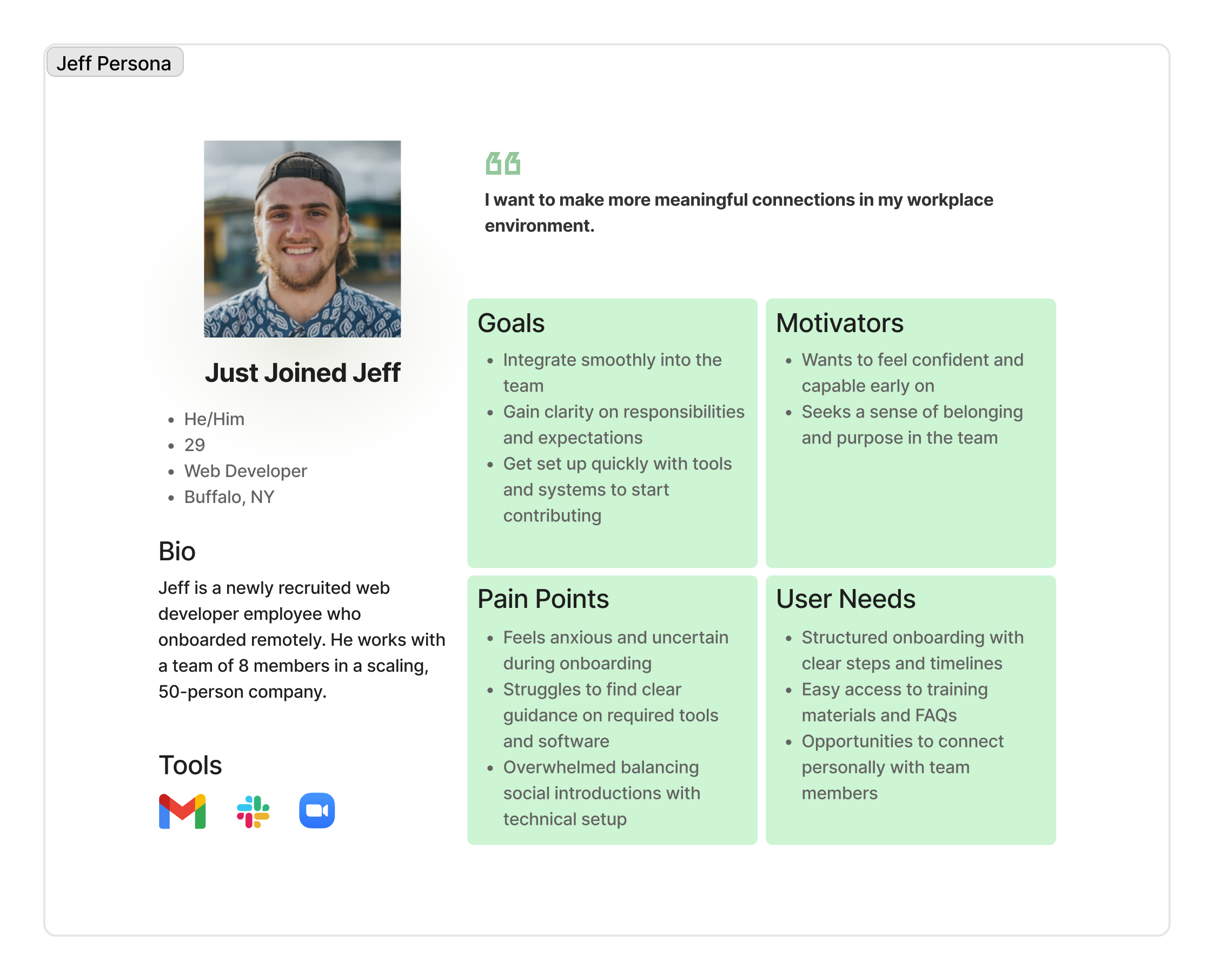
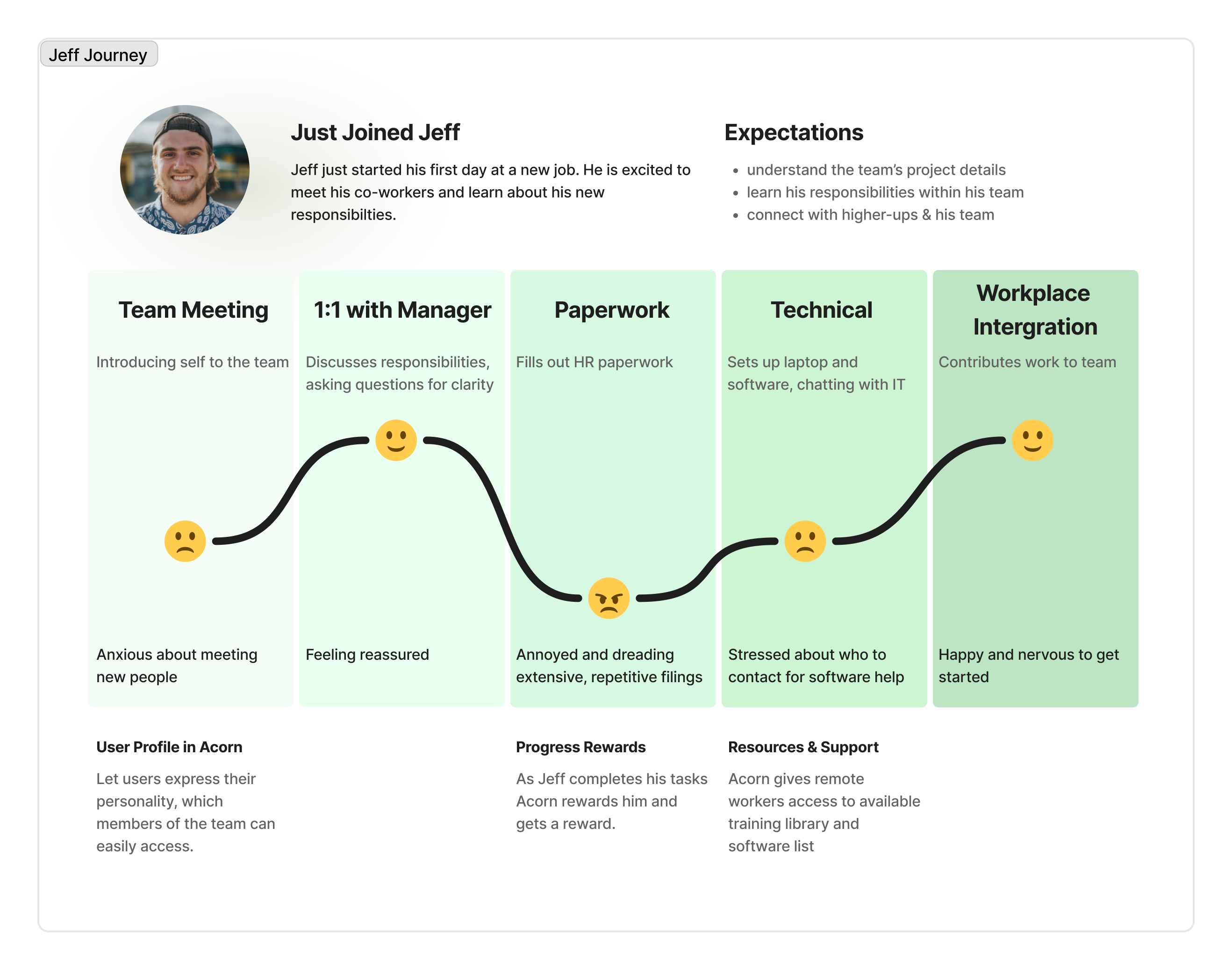
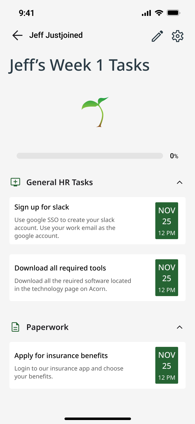
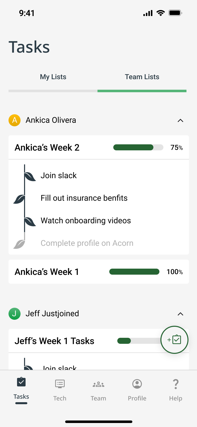
- Scenario for Jeff: As a new employee, I want to understand the roles and responsibilities of my coworkers so that I feel more comfortable collaborating with them.
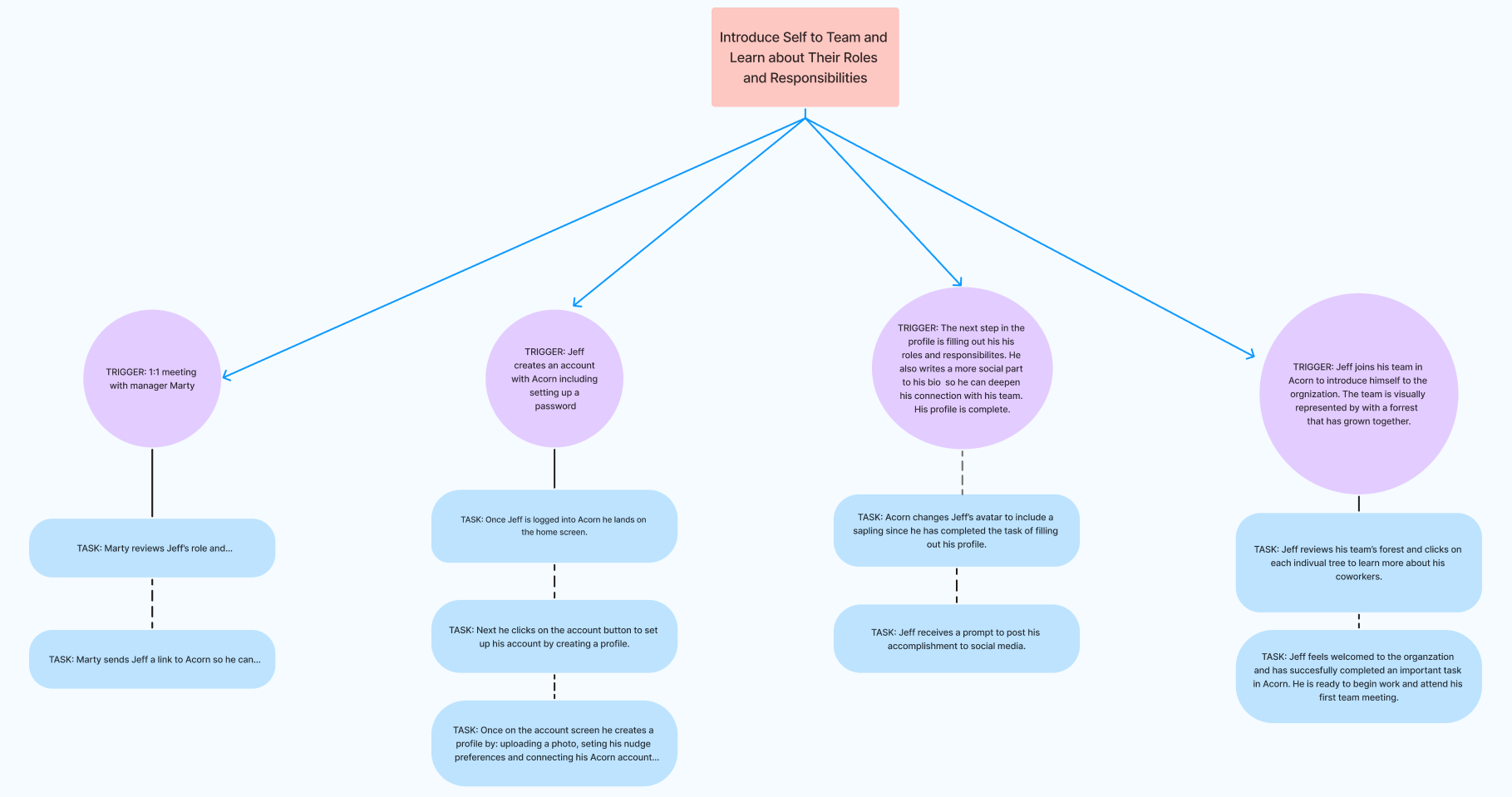
Task Analysis: Jeff, a remote new hire, wants to learn who’s who and to start building work relationships. He uses Acorn’s Unique User Profiles feature to view his teammates' bios and roles. This helps him initiate meaningful conversations and feel more confident with integrating into the team. (Scroll to View More 👉)
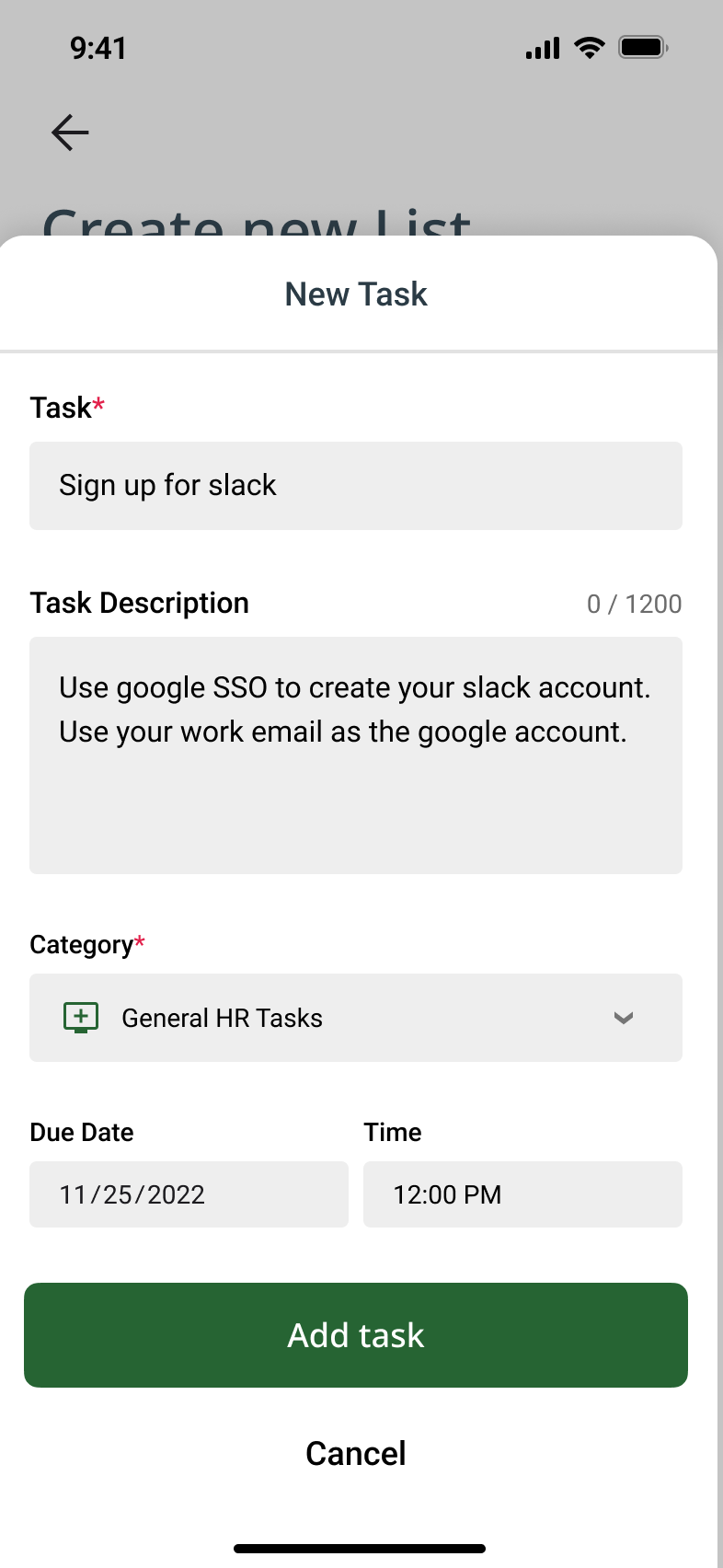
- Scenario for Jeff: As a new employee, I want a centralized place for onboarding documents and resources so I can feel less overwhelmed.
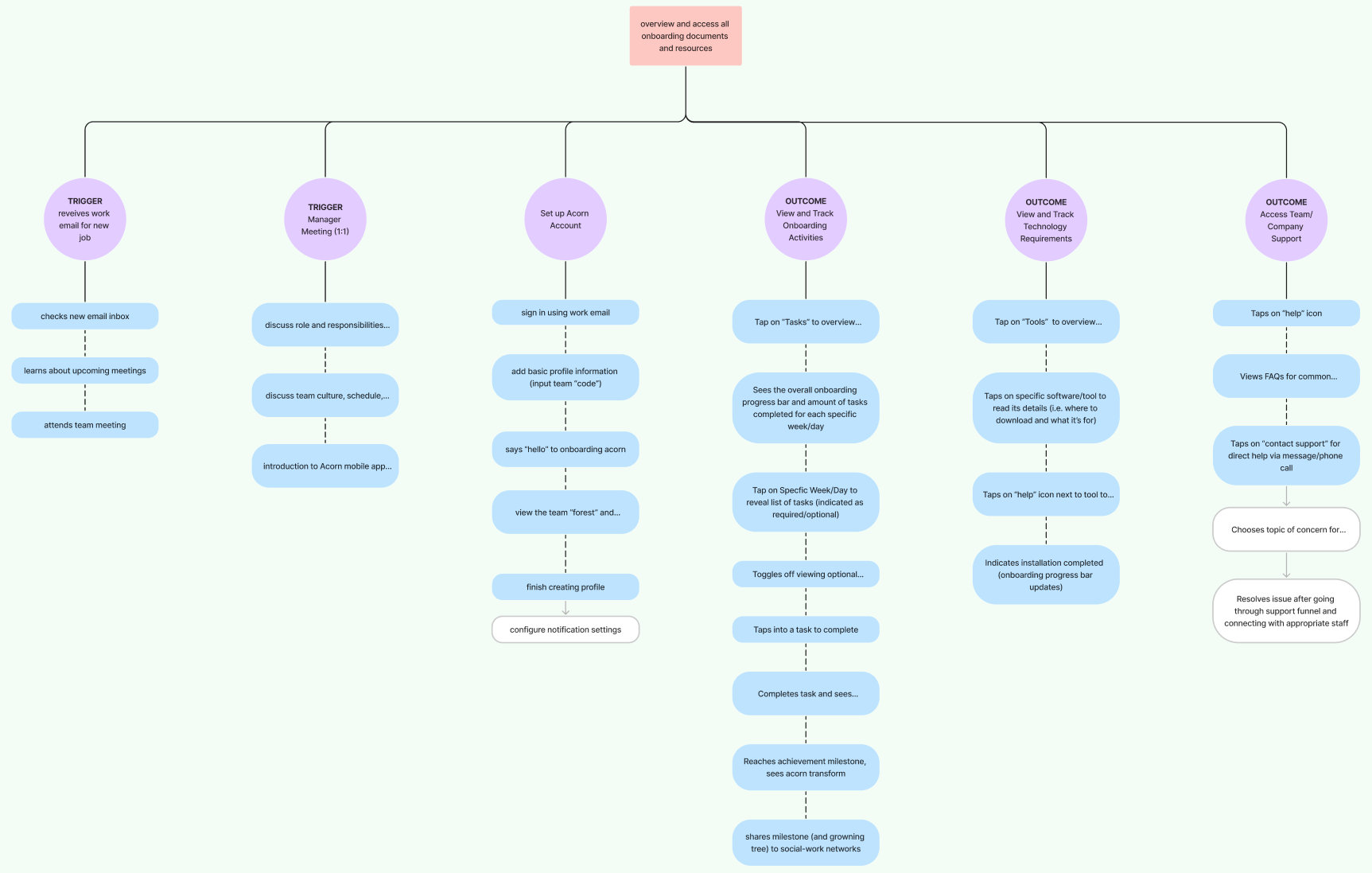
Task Analysis: In order to access onboarding materials, Jeff logs into Acorn and immediately sees a clear Target Checklist and Resources & Support section. With all essential resources in one place clearly broken down into manageable steps, Jeff feels calm and in control. (Scroll to View More 👉)
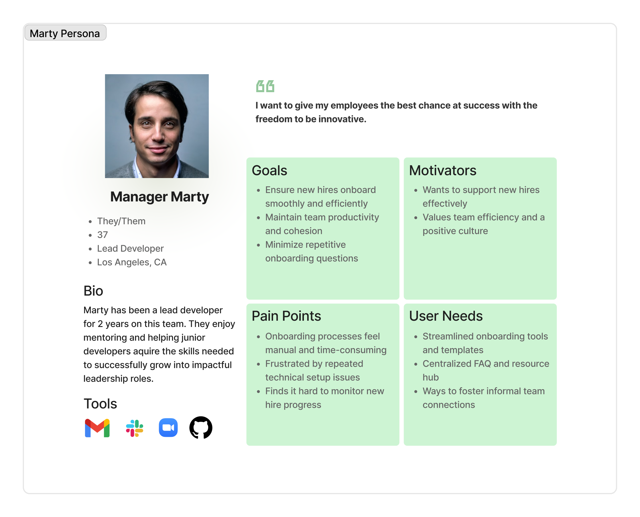
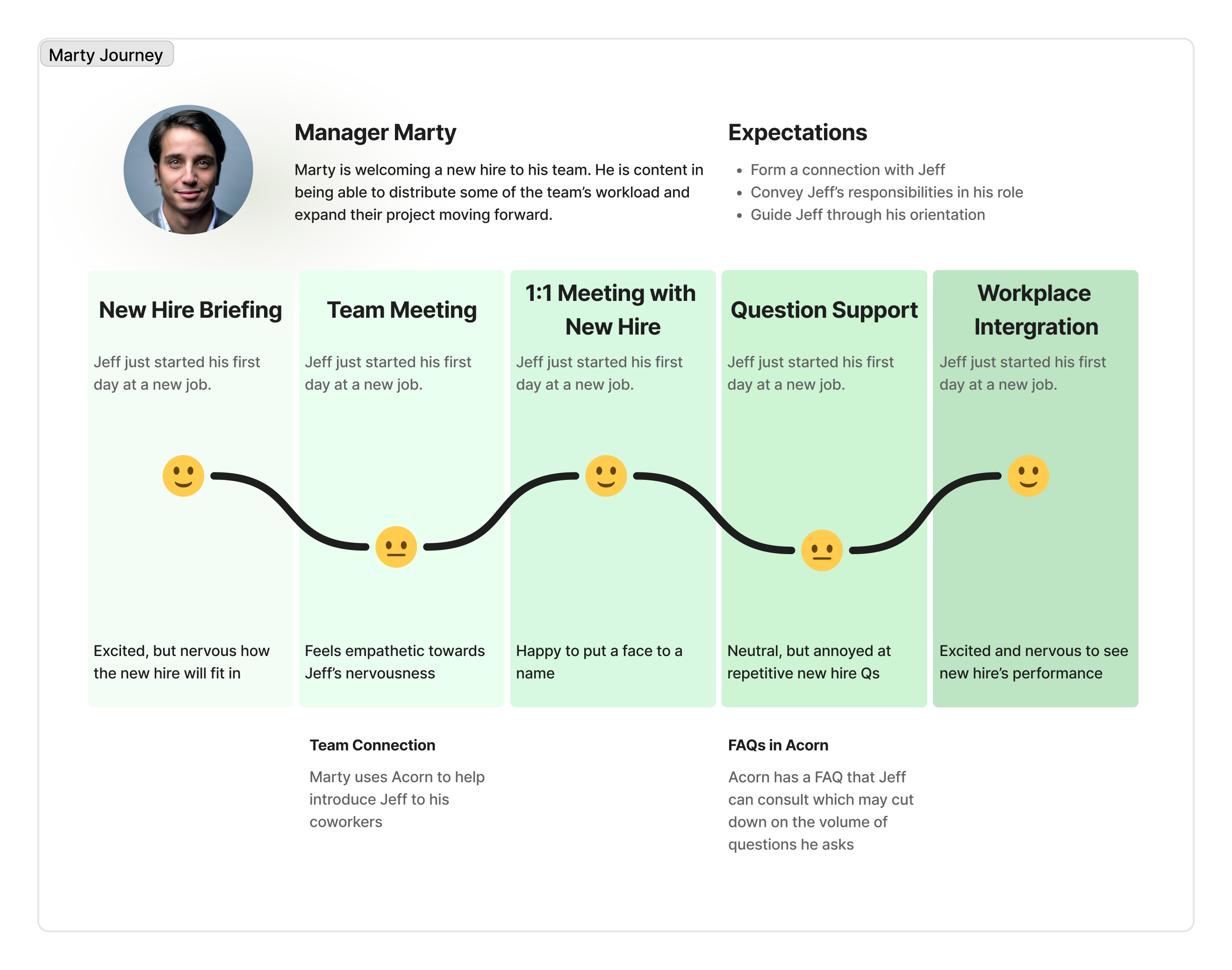
- Scenario for Marty: As a team manager, I want to monitor new hire progress so I can better guide them through onboarding and ease the transition.
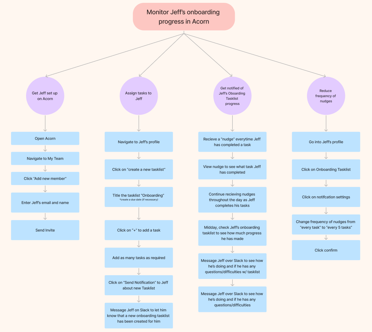
Task Analysis: Marty is able to use the ‘Interaction Monitoring’ dashboard to view and track Jeff’s progress in real-time. He can quickly send nudges, clarify expectations, and step in to intervene when needed — saving them time and reducing ambiguity. (Scroll to View More 👉)
Wireflows
Using these task diagrams, I mapped screen-level wireflows for key actions (like completing tasks and exploring teammate bios), to ensure the app felt calm, intuitive, and empowering from day one.
- Just Joined Jeff’s goal is to learn who teammates are and how to work with them
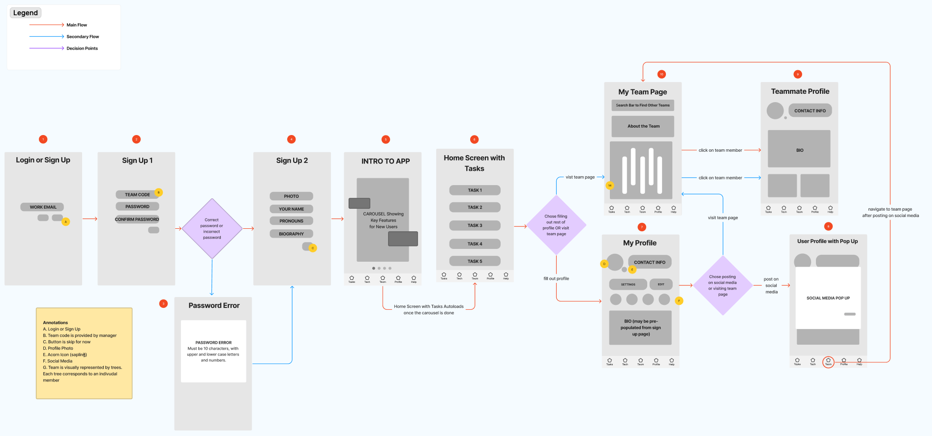
- Just Joined Jeff’s goal is to find documents without stress
- Manager Marty’s goal is to stay up to date with Jeff’s onboarding
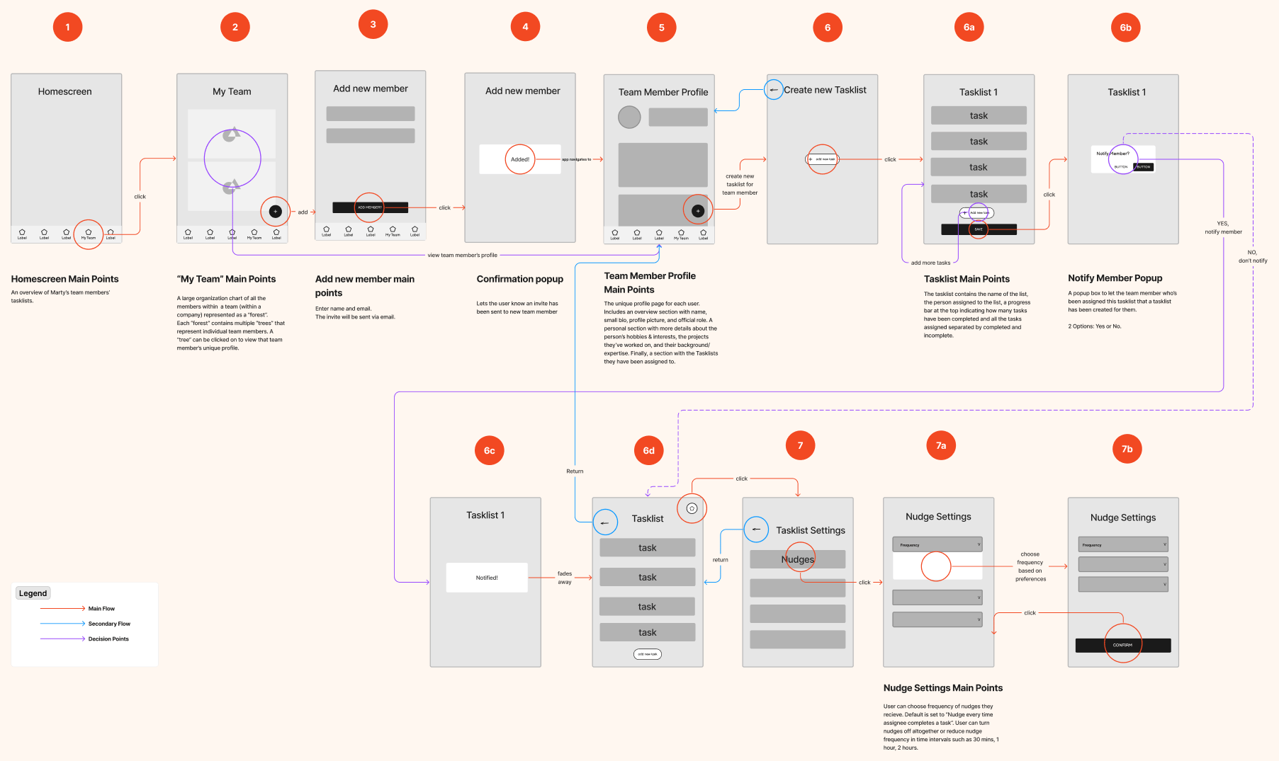
By investing early in scenario building, task analysis, and wireflows, we were able to anticipate user behavior before investing heavily in any single UI direction.
03
Design
Design Decisions
Directing the Design Approach
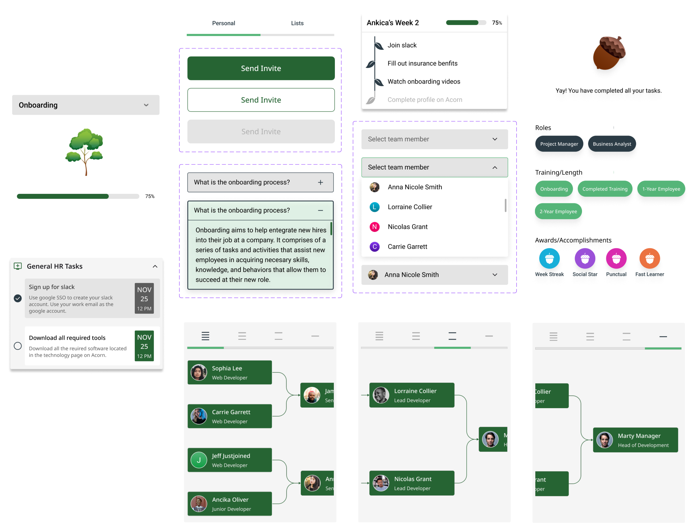
Due to tight deadlines from our key stakeholder and the clarity we achieved through detailed wireflows, our team collectively chose to skip low-fidelity sketches. Instead, I began building mid-fidelity wireframes in Figma that focused on critical screens tied to primary flows and decision points.
To keep our team aligned, I added annotations that prioritized user pain points and essential features—ensuring we stayed within project scope while moving quickly and with purpose.
Key Design Areas
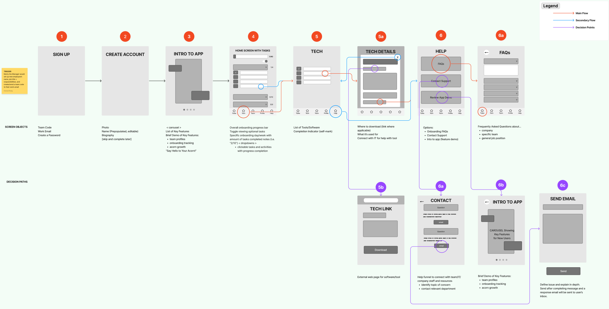
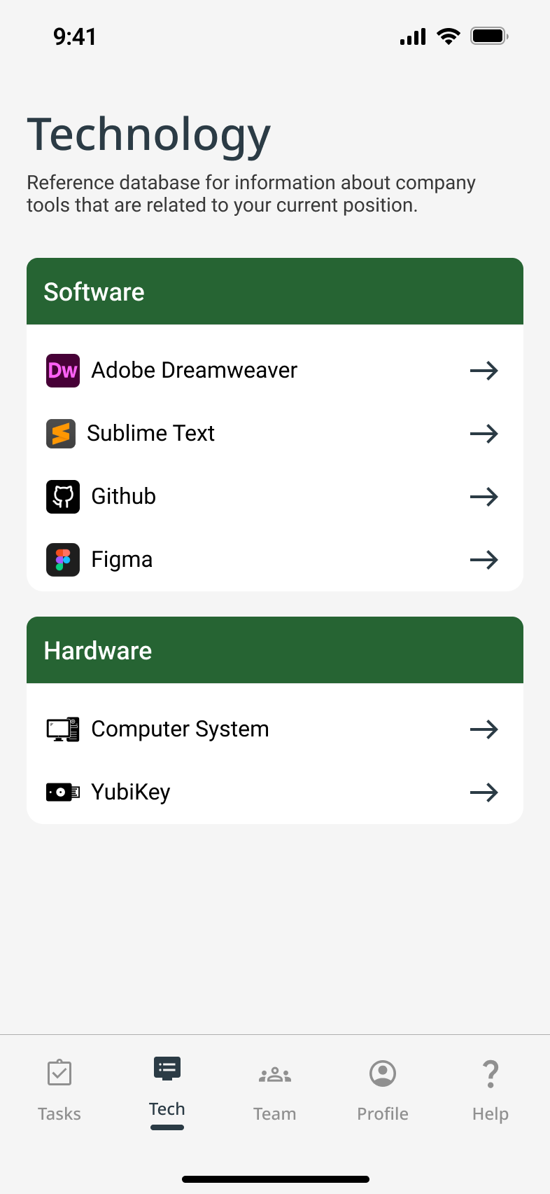
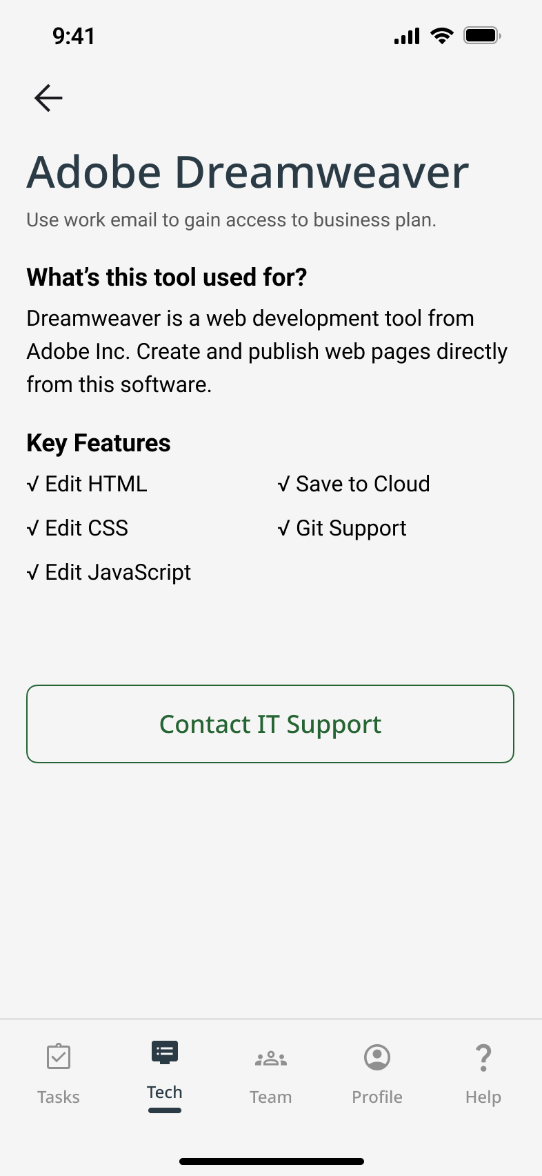
Tech Support
Since a mobile app can’t directly install desktop tools, we designed two help pages as a complementary solution.
- Company & role onboarding FAQs & contact CTA
- Tech tools overview & IT support CTA
To reduce overwhelm and improve clarity for new hires
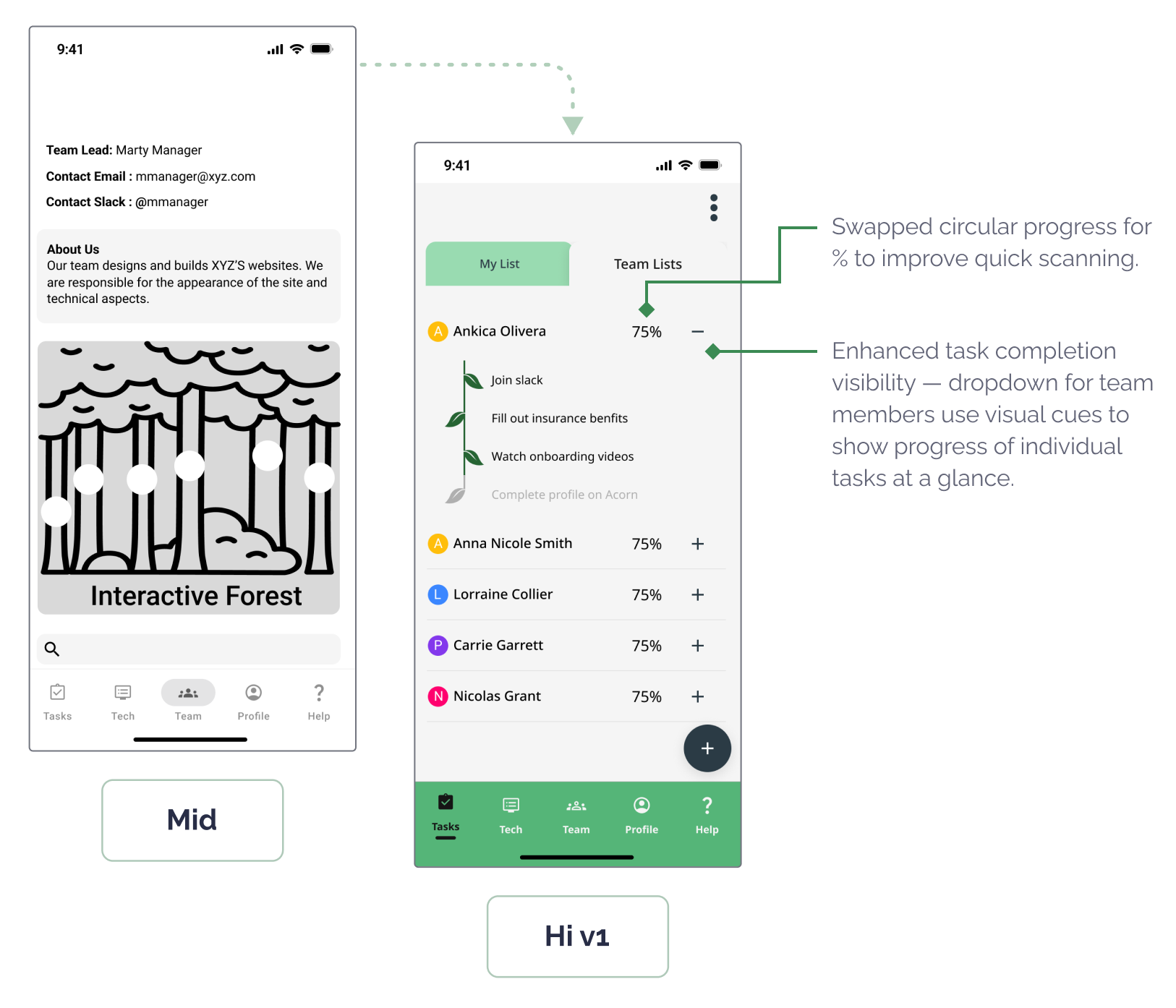
Task Management
We assumed small-to-mid-sized companies where managers play a hands-on onboarding role. This informed the multiple task lists.
- task list creation flows
- dual-view task monitoring—for both the manager and the new hire.
To bring structure so onboarding is easy to track for team managers
Team Connection
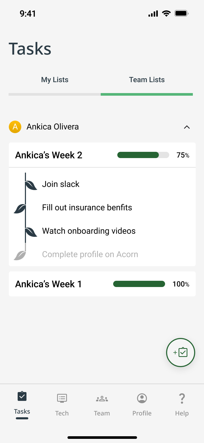
We conceptualized a “forest of teammates,” where each employee profile comprises a tree leaf.
- Roles & responsibilities
- Earned onboarding badges (to gamify progress and encourage engagement)
- Social media-style profile sharing
To foster collaboration from day one for new hires
UI Design
Branding & Design System
We collaboratively developed the visual identity by voting on mood boards, logo sketches, and palettes. Priorities included:
😌 Emotional tone: Calm, supportive, welcoming
♿️ Accessibility: WCAG-compliant color contrasts and legible UI elements
🔁 Consistency: Reusable components and scalable design system
As fidelity increased, visual inconsistencies emerged across team-designed screens. I facilitated a team meeting to align on UI direction and pushed for visual decluttering and accessibility fixes—resulting in a second hi-fi version with better cohesion and clarity.
Moodboard
Typography
Header
ABCDEFGHIJKLMNOPQRSTUVWXYX
Title 1 Medium
ABCDEFGHIJKLMNOPQRSTUVWXYX
Title 2 Regular
ABCDEFGHIJKLMNOPQRSTUVWXYX
Body 1 Semibold
ABCDEFGHIJKLMNOPQRSTUVWXYX
Body 2 Medium
ABCDEFGHIJKLMNOPQRSTUVWXYX
Paragraph 1 Medium
ABCDEFGHIJKLMNOPQRSTUVWXYX
Paragraph 2 Regular
ABCDEFGHIJKLMNOPQRSTUVWXYX
Label
ABCDEFGHIJKLMNOPQRSTUVWXYX
Button
ABCDEFGHIJKLMNOPQRSTUVWXYX
Scroll to View More 👉
Color Palette

#F5F5F5

#266433

#55B578

#282D46
Scroll to View More 👉
Iconography


Clean
Training +
+ Professional +
+ =


Acorn
Scroll to View More 👉
UI Kit
Scroll to View More 👉
Wireframes
Mid-Fidelity to High-Fidelity
We worked on developing a prototype for user testing by incrementally increasing the fidelity of our wireframes to reflect significant refinements based on peer critique and stakeholder feedback. At this stage, we believed we had addressed the most pressing pain points surfaced during early research and synthesis.
- Iteration Highlight: Team Connectivity – Team Tree Screen
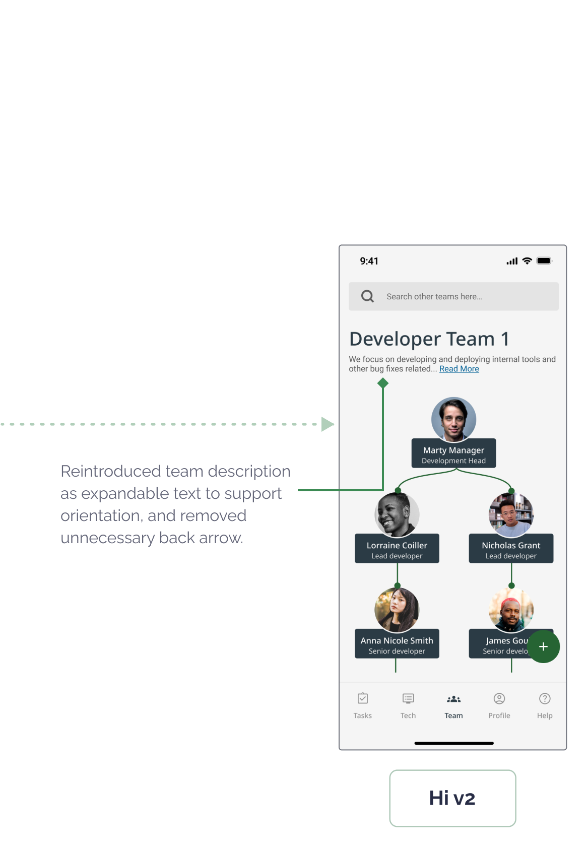
Scroll to View More 👉
- Iteration Highlight: Team Connectivity – Team Tree Screen
Scroll to View More 👉
- Iteration Highlight: Manager Task Tracker – Oversight & Flexibility
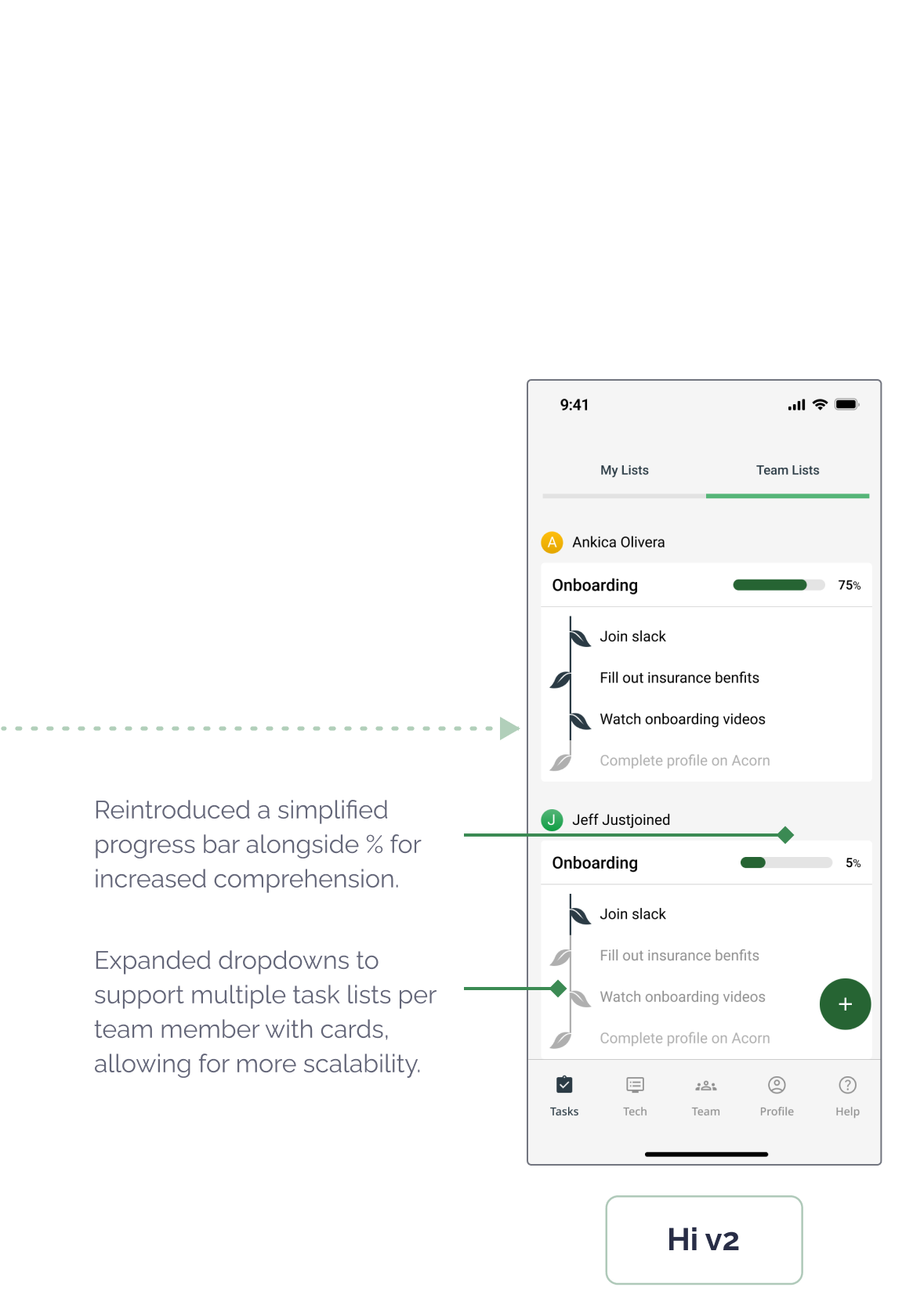
Scroll to View More 👉
These updates were designed to create a more emotionally grounded and accessible experience for both user groups, readying us to user test the effectiveness of our solutions.
04
Test
User Testing
Usability Testing
I co-led two rounds of moderated testing sessions over Zoom with six remote workers, including both new hires and managers at small to mid-sized tech companies. Our goal was to validate whether Acorn addressed the core pain points we set out to solve by observing user behavior across three key flows: onboarding progress, team discovery, and resource access.
Testing Outcomes & Success Metrics
Most importantly, the tests validated our core product direction, while surfacing clarity issues and desktop needs that our early assumptions had missed. This process underscored the importance of iterating based on real-world feedback while balancing scope constraints.

5 of 6 Reported High Satisfaction
5 of 6 user testing participants praised team connection tools as key to feeling integrated with their remote team.
Satisfaction

100% Task Completion
All participants successfully completed onboarding tasks during usability testing, showing clear navigation and intuitive task flows.
Learnability

100% Improved Clarity
Users who had previously felt overwhelmed (initially 67%) described Acorn’s layout and flow as clear and easy to follow.
Error Prevention & Recovery

83% Increased Motivation
Most users responded positively to the acorn-to-tree progress metaphor, saying it helped them understand and track their progress better.
Efficiency
Key Insights
To synthesize the qualitative feedback, I helped lead an user insights mapping session with our team. The main takeaways:
Progress that Grows
The acorn-to-tree metaphor resonated deeply with users, making progress feel tangible, motivating, and emotionally rewarding.
I love the Acorn. It’s such a simple, cute way to show progress. I wish my company had something like this.
Desktop Demand
Several users wanted a desktop version to better support workflows like software setup that are less mobile-friendly.
Honestly, I’d prefer using this on my computer. Some tasks, like setting up software, just aren’t things I’d do on my phone.
Beyond Onboarding
Users saw lasting value in Acorn as a go-to hub for HR and IT support, well beyond their initial onboarding period.
This feels like more than just an onboarding app. I can see using it to track things and get help even after I’m fully onboarded.
Design Impact
User Testing Informed Iterations
Testing the designs with users helped us evolve Acorn into a more emotionally supportive and intuitive tool that better aligned with the realities of remote onboarding and long-term engagement. Overview the key design takeaways:
Flow Tested
✅ What Worked
❌ What Didn’t
➡️ ️Design Response
- Team Connection
Customizable sections like “Expertise” felt meaningful
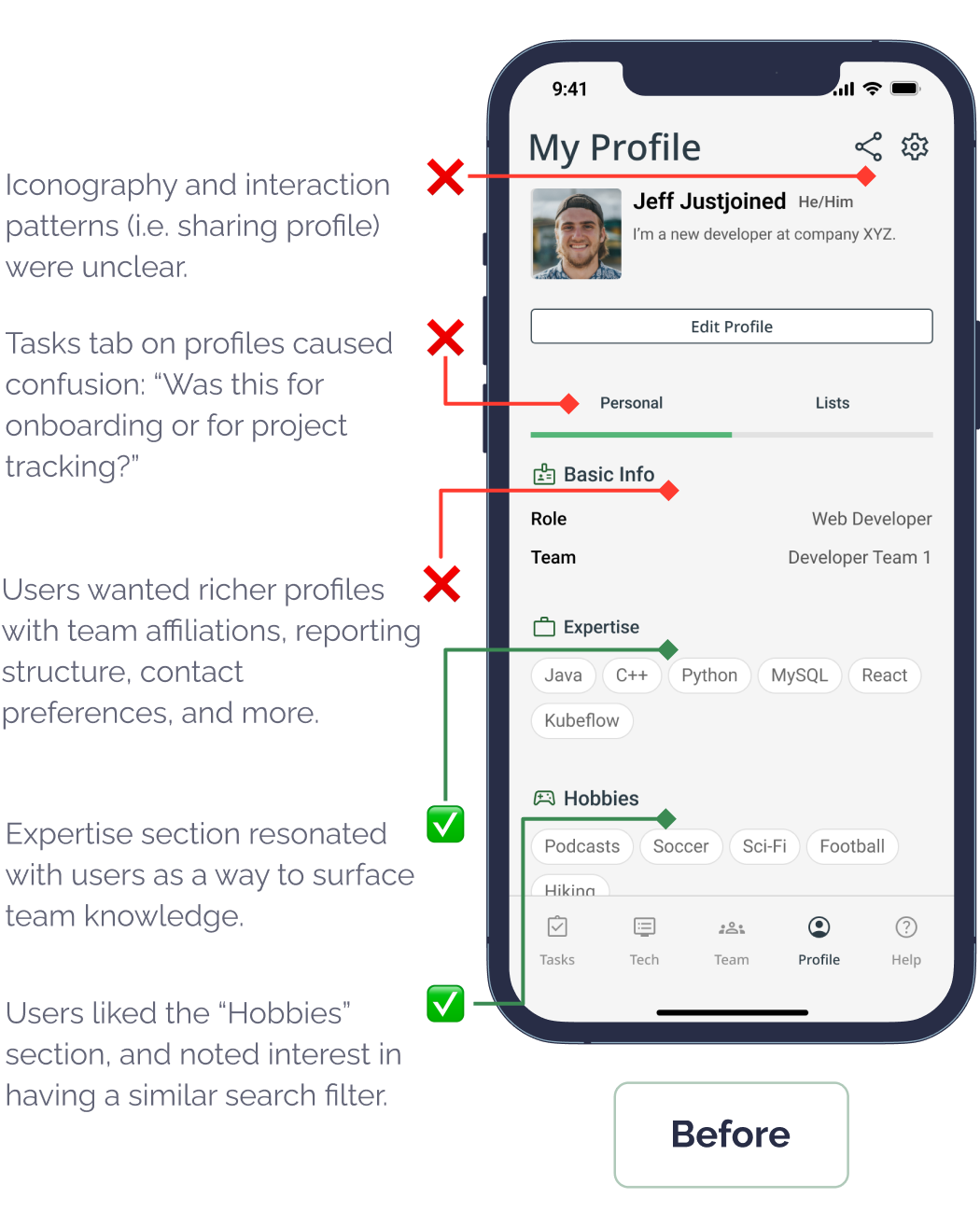
Layout and icon confusion
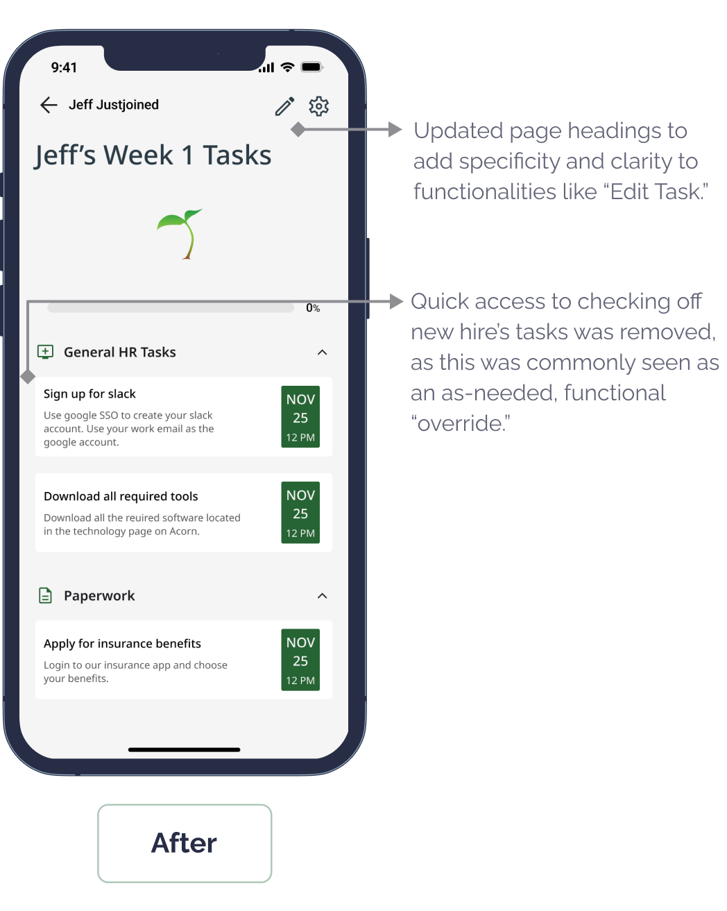
Redesigned UI, added save buttons, removed ambiguous “Tasks” tab
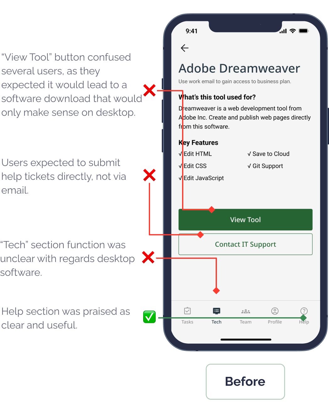
- Tech Support
Users liked the distinct help content
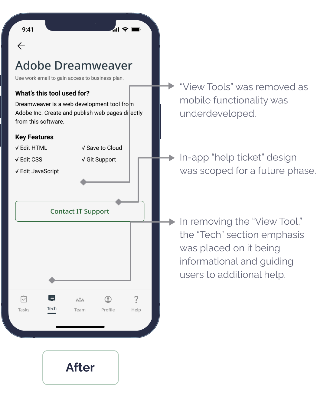
Expected built-in ticketing and found “View Tool” unclear
Scoped in-app ticketing and desktop support for next phase
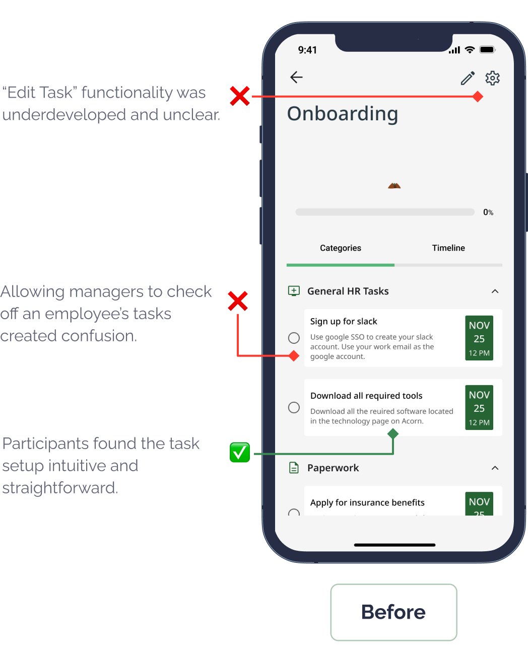
- Task Management
Task setup was intuitive
Task dual-editing was unclear
Simplified permissions and editing UX
Scroll to View More 👉
- Flow for New Hire: Complete Profile and Connect With the Team
Scroll to View More 👉
- Flow for New Hire: Access Tech and Support Resources
Scroll to View More 👉
- Flow for Manager: Set Up a Task List for a New Hire
Scroll to View More 👉
Testing confirmed that even well-received features benefit from refinement.
05
Deliver
Prototype Solution
Final Design Outcome
Iterative feedback was key to making Acorn user-centered and scalable, and helped Acorn feel both intuitive and grounded in user needs.
Before Testing
We focused on core onboarding pain points: social connection, task clarity, and cognitive load. Our designs were informed by stakeholder and colleague feedback.
After Testing
We refined navigation, iconography, and key interactions. We also scoped support for in-app help tickets and a desktop version to address real-world constraints.
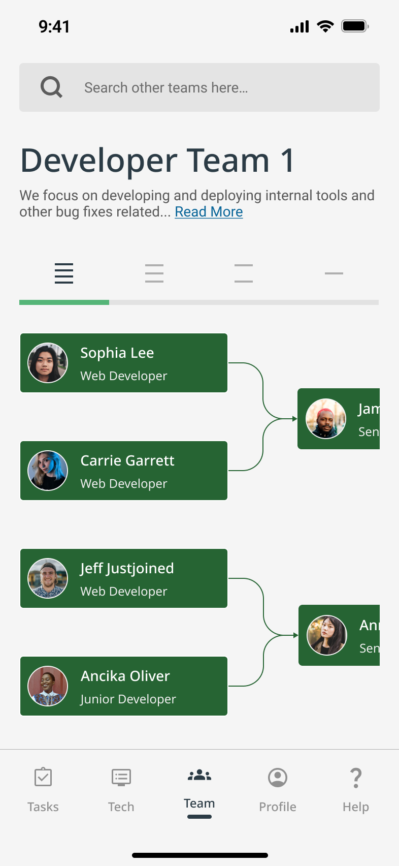
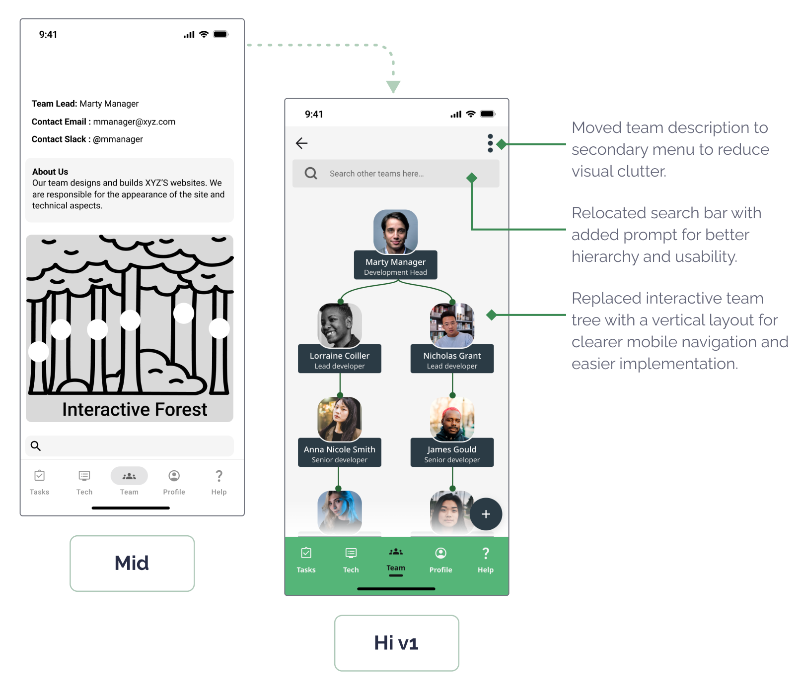
🌲 Rethinking the Team Tree
A major pivot was replacing our “forest” metaphor-based “team tree” with a tabbed, bracket-style diagram.
As teams grew, the original layout became overwhelming. I drew inspiration from CNN’s tournament interface to create a structure that was more navigable and scalable. While we didn’t test it before handoff, the change was grounded in clear usability concerns and team feedback.
Interactive Prototype
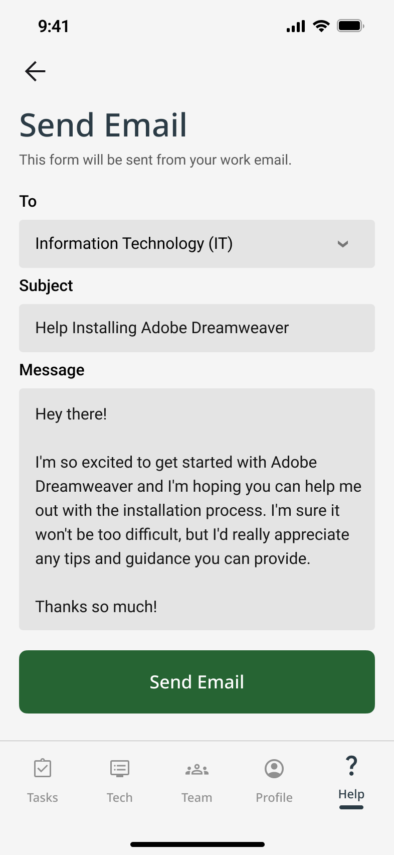
- Final Flow: Help & Tech Support for New Remote Hires
Quickly connecting new hires to IT resources and tools.
✅ Purpose: Guide new hires through essential setup and reduce tech friction.
✅ Key Feature: Centralized help hub with FAQs and IT contact options.
✅ User Benefit: Clear, immediate support reduces overwhelm and accelerates onboarding.
Scroll to View More 👉
Demo Flow: Tech Help

- Final Flow: Profiles & Team Tree
Fostering connection through social-style profiles and a visual team tree.
✅ Purpose: Foster connection and make team structures visible.
✅ Key Feature: Interactive team tree with unique, gamified profiles.
✅ User Benefit: Builds social ties and clarity from day one, easing remote isolation.
Scroll to View More 👉
Demo Flow: Team Connectivity
- Final Flow: Task List Creation for Manager
Enabling managers to assign, track, and support onboarding tasks.
✅ Purpose: Empower managers to customize and track onboarding workflows.
✅ Key Feature: Dual-view task lists for managers and new hires.
✅ User Benefit: Keeps onboarding organized, transparent, and adaptable.
Scroll to View More 👉
Demo Flow: Task Management
Stakeholder Responses
Your risk and mitigation strategies, there's a lot that's going to be on you making decisions. I think it's hard to be the buck stops here person and then also recognize that you have a team that you need to rely on, but you did a really, really nice job
To bring structure so onboarding is easy to track for team managers
Reflection
Retrospective
This project surfaced high-impact wins and helped me grow as a designer. I now approach challenges with a sharper eye for early discovery, scalability, and how products fit into broader ecosystems.


What Went Well
- Visual progress grounded new hires
- Team trees eased remote isolation
- Managers valued task tracking


What I’d Do Differently
- Start research earlier
- Deepen competitive analysis
- Design for scale sooner


Next Steps
- Improve profiles & org navigation
- Test with large teams
- Research HR market fit
- Explore monetization options

Acorn made me more intentional—someone who designs not just for launch, but for what comes next.


Acorn
Designing Better Products with UX/UI Design
UX Research
UX Design

Project Overview
Design Challenge & Responsibilities
Challenge
Design a mobile or wearable app that supports remote employees during onboarding to help them feel more connected to their team and company.
Opportunity
Remote onboarding often lacks clarity, structure, and personal connection, which causes stress and disengagement. This project explored how UX design can humanize the onboarding experience, even from a distance.

Timeline
Oct 23 – Dec 18, 2022 (8 weeks)
Team
4 designers (remote collaboration)
Responsibilities
- UX Research & Synthesis
- Interaction Design & Prototyping
- Usability Testing
- Project Management
Tools
Problem Statement
At this early stage, I considered how onboarding isn’t just a checklist, but a moment of transformation for people. Too often, tools focus on efficiency but forget about integration—not of systems, but of humans into teams. That became the gap Acorn would aim to fill.
How might we support the onboarding process for remote workers so they feel more connected to their new company?
Final Solution Impact
Scalable Remote Onboarding
Acorn’s all-in-one hub extended beyond onboarding, driving long-term engagement and supporting growing teams.
I could see using Acorn well beyond onboarding. It really helps keep things connected and organized as teams grow.
Confidence Through Progress
Acorn reduced overwhelm with clear, motivating progress tracking. 83% of users said it helped them stay on track and engaged.
I really like the Acorn thing—how when you check things off, you get a little reward. It would push me to do it.
Designed to Flex and Grow
Major design pivots made Acorn more intuitive, scalable, and ready to support complex organizations.
The way the team structure was designed made it really easy to follow. It's clear they thought about how this would scale as companies grow.
Design Process

01. Discover
- Competitor Audit
- User Interviews
- Affinity Mapping
- User Personas
- Journey Mapping


02. Define
- Vision Setting
- Feature Prioritizing
- Scenarios
- Task Flows
- Wireflows


03. Design
- Mid-Fidelity Wireframes
- High-Fidelity UI
- Branding & Design System


04. Test
- Usability Testing
- Thematic Analysis
- Iterations Synopsis


05. Deliver
- Interactive Prototype
- Retrospective
- Business Opportunities
- Next Steps
Desk Research
Competitor Audit
We began by asking: Are we entering a red ocean, or can we carve out a blue one?
I led a competitor audit of 8 onboarding platforms, evaluating not just their features, but the emotional experience they offered new hires.
✅ High demand for streamlined all-in-one tools
❌ Limited support for human connection in remote onboarding
Key Findings
Our initial insights opened space for us to focus on emotional and social aspects — not just HR logistics.
01
Discover
We didn’t need to reinvent HR software. We needed to make remote onboarding more human.

User Research
User Interviews
We interviewed 10 remote professionals across tech, marketing, and nonprofit sectors. I co-designed the interview guide and led multiple sessions, balancing emotional insights with operational details with questions like:
When joining a new company/entering a new job, what is most important to you?
Could you summarize your onboarding process? What went well? What didn’t go well?
What were the general/HR activities you had to do and what were the role-specific activities you had to do?
What do you wish had been incorporated into your remote onboarding that wasn’t?
How did onboarding remotely compare to past jobs where you onboarded in person?

Research Synthesis
Affinity Map
After the interviews, we built an affinity map to cluster recurring themes. What emerged were three consistent emotional pain points that hadn’t been fully addressed by existing tools.
Affinity map analyzing quantitative and qualitative user interview data to show patterns and trends sorted into categories like: “connection and guidance,” “social interactions,” “onboarding organization,” and “technical details.”
Key Insights
Lack of Connection
Remote workers struggled to understand their team’s structure or feel part of the group, especially when informal introductions were skipped.
I wasn’t sure how I fit into the team compared with my coworkers.
Overwhelm & Ambiguity
Disorganized onboarding processes left new hires feeling lost. A lack of clear milestones or guidance made it worse.
The first two weeks were extremely overwhelming. I didn’t know what the priorities were.
Tech Access Friction
Remote environments amplified tech-related friction, such as figuring out permissions and accessing basic tools.
There’s a lot of guesswork. You can’t just get up and ask someone.
User Personas
Reflecting on our desk and user research, I guided the team in distilling raw data into a human-centered design strategy. We focused on two key tools to bridge the gap between insight and action: personas and user journeys. These tools helped us clearly articulate the needs of both new hires and their onboarding managers, highlighting pain points and uncovering opportunities for innovation.
User Journeys
Surprisingly, the biggest issue for users wasn't the amount of onboarding content; it was how difficult that onboarding content was to access, navigate, and make use of.

Ideation
Product Vision
The goal of our mobile app was to transform the remote onboarding experience from something isolating and confusing into something clear, motivating, and socially connected. After synthesizing our research and aligning with team discussions, we crafted a vision to guide design decisions:
Acorn is a mobile onboarding companion that helps remote new hires feel connected, confident, and ready to contribute from day one. Through personalized checklists, intuitive progress tracking, and helpful resources, Acorn empowers new hires while building a sense of momentum and belonging.
We introduced a gentle growth metaphor: an acorn that grows into a tree as tasks are completed. The aim was for it to provide emotional reinforcement for progress and to visualize growth in a warm, encouraging way.
App Design Goals
To translate our vision into an actionable strategy, I defined five core app design goals. These would directly support both of our key personas (new hires and team managers), while addressing the emotional and logistical gaps uncovered in research:
Sticky Experience
Build an intuitive, mobile-first app (Android/iOS) that makes onboarding feel lightweight, clear, and rewarding from day one.
Behavioral Nudges
Use subtle, customizable reminders and check-ins to help users feel engaged, supported, and connected to their team without overwhelming them.
Task Tracking
Include transparent onboarding roadmaps and goal-setting features to help new hires track their own progress and increase autonomy and confidence.
Personalization
Allow users to create meaningful profiles with both personal and professional context, supporting authentic team introductions and connections.
Social Motivation
Incorporate activity sharing and optional social integrations to recreate the informal moments that build team trust and cohesion in remote settings.
Features List
I worked with my team to translate these goals into six core features — intentionally scoped to balance user impact, simplicity, and feasibility within our project timeline. Each feature mapped directly to a recurring need we heard during interviews, ensuring our solution remained focused, necessary, and user-driven.
Feature
Application
Solves for
- Interaction Monitoring
Tracks onboarding completion and visually grows the user’s acorn into a tree
😵 Overwhelm & Ambiguity
- Target Setting
Provides a dynamic onboarding checklist with a progress bar
😵 Overwhelm & Ambiguity
- Settings & Configurations
Provides a dynamic onboarding checklist with a progress bar
😵 Overwhelm & Ambiguity
- Social Media Integration
Lets users share profile updates and milestones
💬 Lack of Connection
- Unique User Profiles
Displays team roles and bios to support relationship-building remotely
💬 Lack of Connection
- Resources & Support
Offers tech and general onboarding help in a centralized location
🧩 Tech Access Friction
Scroll to View More 👉
02
Define

Architecture
User Scenarios & Task Analyses
With a clear product vision, feature set, and defined user types, our team created three distinct user scenarios rooted in prioritized user stories. These helped us visualize how each user type might experience the Acorn app by highlighting their goals, tasks, frustrations, and emotional journey throughout onboarding.
For each scenario, we broke down users' top goals into detailed task diagrams. This helped us understand action complexity, mental load, and potential friction points early in the design phase.
- Scenario for Jeff: As a new employee, I want to understand the roles and responsibilities of my coworkers so that I feel more comfortable collaborating with them.
Task Analysis: Jeff, a remote new hire, wants to learn who’s who and to start building work relationships. He uses Acorn’s Unique User Profiles feature to view his teammates' bios and roles. This helps him initiate meaningful conversations and feel more confident with integrating into the team.
- Scenario for Jeff: As a new employee, I want a centralized place for onboarding documents and resources so I can feel less overwhelmed.
Task Analysis: In order to access onboarding materials, Jeff logs into Acorn and immediately sees a clear Target Checklist and Resources & Support section. With all essential resources in one place clearly broken down into manageable steps, Jeff feels calm and in control.
- Scenario for Marty: As a team manager, I want to monitor new hire progress so I can better guide them through onboarding and ease the transition.
Task Analysis: Marty is able to use the ‘Interaction Monitoring’ dashboard to view and track Jeff’s progress in real-time. He can quickly send nudges, clarify expectations, and step in to intervene when needed, saving them time and reducing ambiguity.
Wireflows
Using these task diagrams, I mapped screen-level wireflows for key actions (like completing tasks and exploring teammate bios), to ensure the app felt calm, intuitive, and empowering from day one.
- Just Joined Jeff’s goal is to learn who teammates are and how to work with them
- Just Joined Jeff’s goal is to find documents without stress
- Manager Marty’s goal is to stay up to date with Jeff’s onboarding
By investing early in scenario building, task analysis, and wireflows, we were able to anticipate user behavior before investing heavily in any single UI direction.

03
Design
Design Decisions
Directing the Design Approach
Due to tight deadlines from our key stakeholder and the clarity we achieved through detailed wireflows, our team collectively chose to skip low-fidelity sketches. Instead, I began building mid-fidelity wireframes in Figma that focused on critical screens tied to primary flows and decision points.
To keep our team aligned, I added annotations that prioritized user pain points and essential features—ensuring we stayed within project scope while moving quickly and with purpose.
Key Design Areas
Tech Support
Since a mobile app can’t directly install desktop tools, we designed two help pages as a complementary solution.
- Company & role onboarding FAQs & contact CTA
- Tech tools overview & IT support CTA
To reduce overwhelm and improve clarity for new hires
Task Management
We assumed small-to-mid-sized companies where managers play a hands-on onboarding role. This informed the multiple task lists.
- task list creation flows
- dual-view task monitoring—for both the manager and the new hire.
To bring structure so onboarding is easy to track for team managers
Team Connection
We conceptualized a “forest of teammates,” where each employee profile comprises a tree leaf.
- Roles & responsibilities
- Earned onboarding badges (to gamify progress and encourage engagement)
- Social media-style profile sharing
To foster collaboration from day one for new hires

UI Design
Branding & Design System
We collaboratively developed the visual identity by voting on mood boards, logo sketches, and palettes. Priorities included:
😌 Emotional tone: Calm, supportive, welcoming
♿️ Accessibility: WCAG-compliant color contrasts and legible UI elements
🔁 Consistency: Reusable components and scalable design system
As fidelity increased, visual inconsistencies emerged across team-designed screens. I facilitated a team meeting to align on UI direction and pushed for visual decluttering and accessibility fixes. As a result, my team shifted to a second high fidelity version with better cohesion and clarity.
Moodboard
Typography
Header
ABCDEFGHIJKLMNOPQRSTUVWXYX
Title 1 Medium
ABCDEFGHIJKLMNOPQRSTUVWXYX
Title 2 Regular
ABCDEFGHIJKLMNOPQRSTUVWXYX
Body 1 Semibold
ABCDEFGHIJKLMNOPQRSTUVWXYX
Body 2 Medium
ABCDEFGHIJKLMNOPQRSTUVWXYX
Paragraph 1 Medium
ABCDEFGHIJKLMNOPQRSTUVWXYX
Paragraph 2 Regular
ABCDEFGHIJKLMNOPQRSTUVWXYX
Label
ABCDEFGHIJKLMNOPQRSTUVWXYX
Button
ABCDEFGHIJKLMNOPQRSTUVWXYX
Color Palette

#F5F5F5

#266433

#55B578

#282D46
Iconography


Clean
Training +
+ Professional +
+ =
Acorn
UI Kit

Wireframes
Mid-Fidelity to High-Fidelity
We worked on developing a prototype for user testing by incrementally increasing the fidelity of our wireframes to reflect significant refinements based on peer critique and stakeholder feedback. At this stage, we believed we had addressed the most pressing pain points surfaced during early research and synthesis.
- Iteration Highlight: Team Connectivity – Team Tree Screen
- Iteration Highlight: Team Connectivity – Team Tree Screen
- Iteration Highlight: Manager Task Tracker – Oversight & Flexibility
These updates were designed to create a more emotionally grounded and accessible experience for both user groups, readying us to user test the effectiveness of our solutions.

04
Test
User Testing
Usability Testing
I co-led two rounds of moderated testing sessions over Zoom with six remote workers, including both new hires and managers at small to mid-sized tech companies. Our goal was to validate whether Acorn addressed the core pain points we set out to solve by observing user behavior across three key flows: onboarding progress, team discovery, and resource access.
Testing Outcomes & Success Metrics
Most importantly, the tests validated our core product direction, while surfacing clarity issues and desktop needs that our early assumptions had missed. This process underscored the importance of iterating based on real-world feedback while balancing scope constraints.
5 of 6 Reported High Satisfaction
5 of 6 user testing participants praised team connection tools as key to feeling integrated with their remote team.
Satisfaction
100% Task Completion
All participants successfully completed onboarding tasks during usability testing, showing clear navigation and intuitive task flows.
Learnability
100% Improved Clarity
Users who had previously felt overwhelmed (initially 67%) described Acorn’s layout and flow as clear and easy to follow.
Error Prevention & Recovery
83% Increased Motivation
Most users responded positively to the acorn-to-tree progress metaphor, saying it helped them understand and track their progress better.
Efficiency
Key Insights
To synthesize the qualitative feedback, I helped lead an user insights mapping session with our team. The main takeaways:
Progress that Grows
The acorn-to-tree metaphor resonated deeply with users, making progress feel tangible, motivating, and emotionally rewarding.
I love the Acorn. It’s such a simple, cute way to show progress. I wish my company had something like this.
Desktop Demand
Several users wanted a desktop version to better support workflows like software setup that are less mobile-friendly.
Honestly, I’d prefer using this on my computer. Some tasks, like setting up software, just aren’t things I’d do on my phone.
Beyond Onboarding
Users saw lasting value in Acorn as a go-to hub for HR and IT support, well beyond their initial onboarding period.
This feels like more than just an onboarding app. I can see using it to track things and get help even after I’m fully onboarded.

Design Impact
User Testing Informed Iterations
Testing the designs with users helped us evolve Acorn into a more emotionally supportive and intuitive tool that better aligned with the realities of remote onboarding and long-term engagement. Overview the key design takeaways:
Flow Tested
✅ What Worked
❌ What Didn’t
➡️ ️Design Response
- Team Connection
Customizable sections like “Expertise” felt meaningful
Layout and icon confusion
Redesigned UI, added save buttons, removed ambiguous “Tasks” tab
- Tech Support
Users liked the distinct help content
Expected built-in ticketing and found “View Tool” unclear
Scoped in-app ticketing and desktop support for next phase
- Task Management
Task setup was intuitive
Task dual-editing was unclear
Simplified permissions and editing UX
Scroll to View More 👉
- Flow for New Hire: Complete Profile and Connect With the Team
- Flow for New Hire: Access Tech and Support Resources
- Flow for Manager: Set Up a Task List for a New Hire
Testing confirmed that even well-received features benefit from refinement.
05
Deliver
Prototype Solution
Final Design Outcome
Iterative feedback was key to making Acorn user-centered and scalable, and helped Acorn feel both intuitive and grounded in user needs.
Before Testing
We focused on core onboarding pain points: social connection, task clarity, and cognitive load. Our designs were informed by stakeholder and colleague feedback.
After Testing
We refined navigation, iconography, and key interactions. We also scoped support for in-app help tickets and a desktop version to address real-world constraints.
🌲 Rethinking the Team Tree
A major pivot was replacing our “forest” metaphor-based “team tree” with a tabbed, bracket-style diagram.
As teams grew, the original layout became overwhelming. I drew inspiration from CNN’s tournament interface to create a structure that was more navigable and scalable. While we didn’t test it before handoff, the change was grounded in clear usability concerns and team feedback.
Interactive Prototype
- Final Flow: Help & Tech Support for New Remote Hires
Quickly connecting new hires to IT resources and tools.
✅ Purpose: Guide new hires through essential setup and reduce tech friction.
✅ Key Feature: Centralized help hub with FAQs and IT contact options.
✅ User Benefit: Clear, immediate support reduces overwhelm and accelerates onboarding.
Scroll to View More 👉
Demo Flow: Tech Help
- Final Flow: Profiles & Team Tree
Fostering connection through social-style profiles and a visual team tree.
✅ Purpose: Foster connection and make team structures visible.
✅ Key Feature: Interactive team tree with unique, gamified profiles.
✅ User Benefit: Builds social ties and clarity from day one, easing remote isolation.
Scroll to View More 👉
Demo Flow: Team Connectivity
- Final Flow: Task List Creation for Manager
Enabling managers to assign, track, and support onboarding tasks.
✅ Purpose: Empower managers to customize and track onboarding workflows.
✅ Key Feature: Dual-view task lists for managers and new hires.
✅ User Benefit: Keeps onboarding organized, transparent, and adaptable.
Demo Flow: Task Management
Stakeholder Responses
Your risk and mitigation strategies, there's a lot that's going to be on you making decisions. I think it's hard to be the buck stops here person and then also recognize that you have a team that you need to rely on, but you did a really, really nice job.
To bring structure so onboarding is easy to track for team managers
Reflection
Retrospective
This project surfaced high-impact wins and helped me grow as a designer. I now approach challenges with a sharper eye for early discovery, scalability, and how products fit into broader ecosystems.

What Went Well
- Visual progress grounded new hires
- Team trees eased remote isolation
- Managers valued task tracking

What I’d Do Differently
- Start research earlier
- Deepen competitive analysis
- Design for scale sooner

Next Steps
- Improve profiles & org navigation
- Test with large teams
- Research HR market fit
- Explore monetization options
Acorn made me more intentional—someone who designs not just for launch, but for what comes next.


Acorn
Designing Better Products with UX/UI Design
UX Research
UX Design

Project Overview
Design Challenge & Responsibilities
Challenge
Design a mobile or wearable app that supports remote employees during onboarding to help them feel more connected to their team and company.
Opportunity
Remote onboarding often lacks clarity, structure, and personal connection, which causes stress and disengagement. This project explored how UX design can humanize the onboarding experience, even from a distance.

Timeline
Oct 23 – Dec 18, 2022 (8 weeks)
Team
4 designers (remote collaboration)
Responsibilities
- UX Research & Synthesis
- Interaction Design & Prototyping
- Usability Testing
- Project Management
Tools
Problem Statement
At this early stage, I considered how onboarding isn’t just a checklist, but a moment of transformation for people. Too often, tools focus on efficiency but forget about integration—not of systems, but of humans into teams. That became the gap Acorn would aim to fill.
How might we support the onboarding process for remote workers so they feel more connected to their new company?
Final Solution Impact
Scalable Remote Onboarding
Acorn’s all-in-one hub extended beyond onboarding, driving long-term engagement and supporting growing teams.
I could see using Acorn well beyond onboarding. It really helps keep things connected and organized as teams grow.
Confidence Through Progress
Acorn reduced overwhelm with clear, motivating progress tracking. 83% of users said it helped them stay on track and engaged.
I really like the Acorn thing—how when you check things off, you get a little reward. It would push me to do it.
Designed to Flex and Grow
Major design pivots made Acorn more intuitive, scalable, and ready to support complex organizations.
The way the team structure was designed made it really easy to follow. It's clear they thought about how this would scale as companies grow.
Design Process

01. Discover
- Competitor Audit
- User Interviews
- Affinity Mapping
- User Personas
- Journey Mapping

02. Define
- Vision Setting
- Feature Prioritizing
- Scenarios
- Task Flows
- Wireflows
03. Design
- Mid-Fidelity Wireframes
- High-Fidelity UI
- Branding & Design System

04. Test
- Usability Testing
- Thematic Analysis
- Iterations Synopsis

05. Deliver
- Interactive Prototype
- Retrospective
- Business Opportunities
- Next Steps
Desk Research
Competitor Audit
We began by asking: Are we entering a red ocean, or can we carve out a blue one?
I led a competitor audit of 8 onboarding platforms, evaluating not just their features, but the emotional experience they offered new hires.
✅ High demand for streamlined all-in-one tools
❌ Limited support for human connection in remote onboarding
Key Findings
Our initial insights opened space for us to focus on emotional and social aspects beyond HR logistics.
01
Discover
We didn’t need to reinvent HR software. We needed to make remote onboarding more human.

User Research
User Interviews
We interviewed 10 remote professionals across tech, marketing, and nonprofit sectors. I co-designed the interview guide and led multiple sessions, balancing emotional insights with operational details with questions like:
When joining a new company/entering a new job, what is most important to you?
Could you summarize your onboarding process? What went well? What didn’t go well?
What were the general/HR activities you had to do and what were the role-specific activities you had to do?
What do you wish had been incorporated into your remote onboarding that wasn’t?
How did onboarding remotely compare to past jobs where you onboarded in person?

Research Synthesis
Affinity Map
After the interviews, we built an affinity map to cluster recurring themes. What emerged were three consistent emotional pain points that hadn’t been fully addressed by existing tools.
Affinity map analyzing quantitative and qualitative user interview data to show patterns and trends sorted into categories like: “connection and guidance,” “social interactions,” “onboarding organization,” and “technical details.”
Key Insights
Lack of Connection
Remote workers struggled to understand their team’s structure or feel part of the group, especially when informal introductions were skipped.
I wasn’t sure how I fit into the team compared with my coworkers.
Overwhelm & Ambiguity
Disorganized onboarding processes left new hires feeling lost. A lack of clear milestones or guidance made it worse.
The first two weeks were extremely overwhelming. I didn’t know what the priorities were.
Tech Access Friction
Remote environments amplified tech-related friction, such as figuring out permissions and accessing basic tools.
There’s a lot of guesswork. You can’t just get up and ask someone.
User Personas
Reflecting on our desk and user research, I guided the team in distilling raw data into a human-centered design strategy. We focused on two key tools to bridge the gap between insight and action: personas and user journeys. These tools helped us clearly articulate the needs of both new hires and their onboarding managers, highlighting pain points and uncovering opportunities for innovation.
User Journeys
Surprisingly, the biggest issue for users wasn't the amount of onboarding content; it was how difficult that onboarding content was to access, navigate, and make use of.

Ideation
Product Vision
The goal of our mobile app was to transform the remote onboarding experience from something isolating and confusing into something clear, motivating, and socially connected. After synthesizing our research and aligning with team discussions, we crafted a vision to guide design decisions:
Acorn is a mobile onboarding companion that helps remote new hires feel connected, confident, and ready to contribute from day one. Through personalized checklists, intuitive progress tracking, and helpful resources, Acorn empowers new hires while building a sense of momentum and belonging.
We introduced a gentle growth metaphor: an acorn that grows into a tree as tasks are completed. The aim was for it to provide emotional reinforcement for progress and to visualize growth in a warm, encouraging way.
App Design Goals
To translate our vision into an actionable strategy, I defined five core app design goals. These would directly support both of our key personas (new hires and team managers), while addressing the emotional and logistical gaps uncovered in research:
Sticky Experience
Build an intuitive, mobile-first app (Android/iOS) that makes onboarding feel lightweight, clear, and rewarding from day one.
Behavioral Nudges
Use subtle, customizable reminders and check-ins to help users feel engaged, supported, and connected to their team without overwhelming them.
Task Tracking
Include transparent onboarding roadmaps and goal-setting features to help new hires track their own progress and increase autonomy and confidence.
Personalization
Allow users to create meaningful profiles with both personal and professional context, supporting authentic team introductions and connections.
Social Motivation
Incorporate activity sharing and optional social integrations to recreate the informal moments that build team trust and cohesion in remote settings.
Features List
I worked with my team to translate these goals into six core features that were intentionally scoped to balance user impact, simplicity, and feasibility within our project timeline. Each feature mapped directly to a recurring need we heard during interviews, ensuring our solution remained focused, necessary, and user-driven.
Feature
Application
Solves for
- Interaction Monitoring
Tracks onboarding completion and visually grows the user’s acorn into a tree
😵 Overwhelm & Ambiguity
- Target Setting
Provides a dynamic onboarding checklist with a progress bar
😵 Overwhelm & Ambiguity
- Settings & Configurations
Provides a dynamic onboarding checklist with a progress bar
😵 Overwhelm & Ambiguity
- Social Media Integration
Lets users share profile updates and milestones
💬 Lack of Connection
- Unique User Profiles
Displays team roles and bios to support relationship-building remotely
💬 Lack of Connection
- Resources & Support
Offers tech and general onboarding help in a centralized location
🧩 Tech Access Friction
02
Define

Architecture
User Scenarios & Task Analyses
With a clear product vision, feature set, and defined user types, our team created three distinct user scenarios rooted in prioritized user stories. These helped us visualize how each user type might experience the Acorn app by highlighting their goals, tasks, frustrations, and emotional journey throughout onboarding.
For each scenario, we broke down users' top goals into detailed task diagrams. This helped us understand action complexity, mental load, and potential friction points early in the design phase.
- Scenario for Jeff: As a new employee, I want to understand the roles and responsibilities of my coworkers so that I feel more comfortable collaborating with them.
Task Analysis: Jeff, a remote new hire, wants to learn who’s who and to start building work relationships. He uses Acorn’s Unique User Profiles feature to view his teammates' bios and roles. This helps him initiate meaningful conversations and feel more confident with integrating into the team.
- Scenario for Jeff: As a new employee, I want a centralized place for onboarding documents and resources so I can feel less overwhelmed.
Task Analysis: In order to access onboarding materials, Jeff logs into Acorn and immediately sees a clear Target Checklist and Resources & Support section. With all essential resources in one place clearly broken down into manageable steps, Jeff feels calm and in control.
- Scenario for Marty: As a team manager, I want to monitor new hire progress so I can better guide them through onboarding and ease the transition.
Task Analysis: Marty is able to use the ‘Interaction Monitoring’ dashboard to view and track Jeff’s progress in real-time. He can quickly send nudges, clarify expectations, and step in to intervene when needed, saving them time and reducing ambiguity.
Wireflows
Using these task diagrams, I mapped screen-level wireflows for key actions (like completing tasks and exploring teammate bios), to ensure the app felt calm, intuitive, and empowering from day one.
- Just Joined Jeff’s goal is to learn who teammates are and how to work with them
- Just Joined Jeff’s goal is to find documents without stress
- Manager Marty’s goal is to stay up to date with Jeff’s onboarding
By investing early in scenario building, task analysis, and wireflows, we were able to anticipate user behavior before investing heavily in any single UI direction.


03
Design
Design Decisions
Directing the Design Approach
Due to tight deadlines from our key stakeholder and the clarity we achieved through detailed wireflows, our team collectively chose to skip low-fidelity sketches. Instead, I began building mid-fidelity wireframes in Figma that focused on critical screens tied to primary flows and decision points.
To keep our team aligned, I added annotations that prioritized user pain points and essential features. That way, we stayed within project scope while moving quickly and with purpose.
Key Design Areas
Tech Support
Since a mobile app can’t directly install desktop tools, we designed two help pages as a complementary solution.
- Company & role onboarding FAQs & contact CTA
- Tech tools overview & IT support CTA
To reduce overwhelm and improve clarity for new hires
Task Management
We assumed small-to-mid-sized companies where managers play a hands-on onboarding role. This informed the multiple task lists.
- task list creation flows
- dual-view task monitoring—for both the manager and the new hire.
To bring structure so onboarding is easy to track for team managers
Team Connection
We conceptualized a “forest of teammates,” where each employee profile comprises a tree leaf.
- Roles & responsibilities
- Earned onboarding badges (to gamify progress and encourage engagement)
- Social media-style profile sharing
To foster collaboration from day one for new hires

Moodboard
UI Design
Branding & Design System
We collaboratively developed the visual identity by voting on mood boards, logo sketches, and palettes. Priorities included:
😌 Emotional tone: Calm, supportive, welcoming
♿️ Accessibility: WCAG-compliant color contrasts and legible UI elements
🔁 Consistency: Reusable components and scalable design system
As fidelity increased, visual inconsistencies emerged across team-designed screens. I facilitated a team meeting to align on UI direction and pushed for visual decluttering and accessibility fixes. As a result, my team shifted to a second high fidelity version with better cohesion and clarity.
Typography
Header
ABCDEFGHIJKLMNOPQRSTUVWXYX
Title 1 Medium
ABCDEFGHIJKLMNOPQRSTUVWXYX
Title 2 Regular
ABCDEFGHIJKLMNOPQRSTUVWXYX
Body 1 Semibold
ABCDEFGHIJKLMNOPQRSTUVWXYX
Body 2 Medium
ABCDEFGHIJKLMNOPQRSTUVWXYX
Paragraph 1 Medium
ABCDEFGHIJKLMNOPQRSTUVWXYX
Paragraph 2 Regular
ABCDEFGHIJKLMNOPQRSTUVWXYX
Label
ABCDEFGHIJKLMNOPQRSTUVWXYX
Button
ABCDEFGHIJKLMNOPQRSTUVWXYX
Color Palette

#F5F5F5

#266433

#55B578

#282D46
Iconography
Clean
Training +
+ Professional +
+ =
Acorn
UI Kit

Wireframes
Mid-Fidelity to High-Fidelity
We worked on developing a prototype for user testing by incrementally increasing the fidelity of our wireframes to reflect significant refinements based on peer critique and stakeholder feedback. At this stage, we believed we had addressed the most pressing pain points surfaced during early research and synthesis.
- Iteration Highlight: Team Connectivity – Team Tree Screen
- Iteration Highlight: Team Connectivity – Team Tree Screen
- Iteration Highlight: Manager Task Tracker – Oversight & Flexibility
These updates were designed to create a more emotionally grounded and accessible experience for both user groups, readying us to user test the effectiveness of our solutions.

04
Test
User Testing
Usability Testing
I co-led two rounds of moderated testing sessions over Zoom with six remote workers, including both new hires and managers at small to mid-sized tech companies. Our goal was to validate whether Acorn addressed the core pain points we set out to solve by observing user behavior across three key flows: onboarding progress, team discovery, and resource access.
Testing Outcomes & Success Metrics
Most importantly, the tests validated our core product direction, while surfacing clarity issues and desktop needs that our early assumptions had missed. This process underscored the importance of iterating based on real-world feedback while balancing scope constraints.
5 of 6 Reported High Satisfaction
5 of 6 user testing participants praised team connection tools as key to feeling integrated with their remote team.
Satisfaction
100% Task Completion
All participants successfully completed onboarding tasks during usability testing, showing clear navigation and intuitive task flows.
Learnability
100% Improved Clarity
Users who had previously felt overwhelmed (initially 67%) described Acorn’s layout and flow as clear and easy to follow.
Error Prevention & Recovery
83% Increased Motivation
Most users responded positively to the acorn-to-tree progress metaphor, saying it helped them understand and track their progress better.
Efficiency
Key Insights
To synthesize the qualitative feedback, I helped lead an user insights mapping session with our team. The main takeaways:
Progress that Grows
The acorn-to-tree metaphor resonated deeply with users, making progress feel tangible, motivating, and emotionally rewarding.
I love the Acorn. It’s such a simple, cute way to show progress. I wish my company had something like this.
Desktop Demand
Several users wanted a desktop version to better support workflows like software setup that are less mobile-friendly.
Honestly, I’d prefer using this on my computer. Some tasks, like setting up software, just aren’t things I’d do on my phone.
Beyond Onboarding
Users saw lasting value in Acorn as a go-to hub for HR and IT support, well beyond their initial onboarding period.
This feels like more than just an onboarding app. I can see using it to track things and get help even after I’m fully onboarded.

Design Impact
User Testing Informed Iterations
Testing the designs with users helped us evolve Acorn into a more emotionally supportive and intuitive tool that better aligned with the realities of remote onboarding and long-term engagement. Overview the key design takeaways:
Flow Tested
✅ What Worked
❌ What Didn’t
➡️ ️Design Response
- Team Connection
Customizable sections like “Expertise” felt meaningful
Layout and icon confusion
Redesigned UI, added save buttons, removed ambiguous “Tasks” tab
- Tech Support
Users liked the distinct help content
Expected built-in ticketing and found “View Tool” unclear
Scoped in-app ticketing and desktop support for next phase
- Task Management
Task setup was intuitive
Task dual-editing was unclear
Simplified permissions and editing UX
- Flow for New Hire: Complete Profile and Connect With the Team
- Flow for New Hire: Access Tech and Support Resources
- Flow for Manager: Set Up a Task List for a New Hire
Testing confirmed that even well-received features benefit from refinement.

05
Deliver
Prototype Solution
Final Design Outcome
Iterative feedback was key to making Acorn user-centered and scalable, and helped Acorn feel both intuitive and grounded in user needs.
Before Testing
We focused on core onboarding pain points: social connection, task clarity, and cognitive load. Our designs were informed by stakeholder and colleague feedback.
After Testing
We refined navigation, iconography, and key interactions. We also scoped support for in-app help tickets and a desktop version to address real-world constraints.
🌲 Rethinking the Team Tree
A major pivot was replacing our “forest” metaphor-based “team tree” with a tabbed, bracket-style diagram.
As teams grew, the original layout became overwhelming. I drew inspiration from CNN’s tournament interface to create a structure that was more navigable and scalable. While we didn’t test it before handoff, the change was grounded in clear usability concerns and team feedback.
Interactive Prototype
- Final Flow: Help & Tech Support for New Remote Hires
Quickly connecting new hires to IT resources and tools.
✅ Purpose: Guide new hires through essential setup and reduce tech friction.
✅ Key Feature: Centralized help hub with FAQs and IT contact options.
✅ User Benefit: Clear, immediate support reduces overwhelm and accelerates onboarding.
Demo Flow: Tech Help
Demo Flow: Team Connectivity
- Final Flow: Profiles & Team Tree
Fostering connection through social-style profiles and a visual team tree.
✅ Purpose: Foster connection and make team structures visible.
✅ Key Feature: Interactive team tree with unique, gamified profiles.
✅ User Benefit: Builds social ties and clarity from day one, easing remote isolation.
- Final Flow: Task List Creation for Manager
Enabling managers to assign, track, and support onboarding tasks.
✅ Purpose: Empower managers to customize and track onboarding workflows.
✅ Key Feature: Dual-view task lists for managers and new hires.
✅ User Benefit: Keeps onboarding organized, transparent, and adaptable.
Demo Flow: Task Management
Stakeholder Responses
I think it's hard to be the buck stops here person and then also recognize that you have a team that you need to rely on, but you did a really, really nice job.
I continue to be really impressed by how much you guys were able to do in seven weeks. It's truly astonishing. Nice work.
Reflection
Retrospective
This project surfaced high-impact wins and helped me grow as a designer. I now approach challenges with a sharper eye for early discovery, scalability, and how products fit into broader ecosystems.
What Went Well
- Visual progress grounded new hires
- Team trees eased remote isolation
- Managers valued task tracking

What I’d Do Differently
- Start research earlier
- Deepen competitive analysis
- Design for scale sooner

Next Steps
- Improve profiles & org navigation
- Test with large teams
- Research HR market fit
- Explore monetization options
Acorn made me more intentional—someone who designs not just for launch, but for what comes next.